MaISON GUILHEM
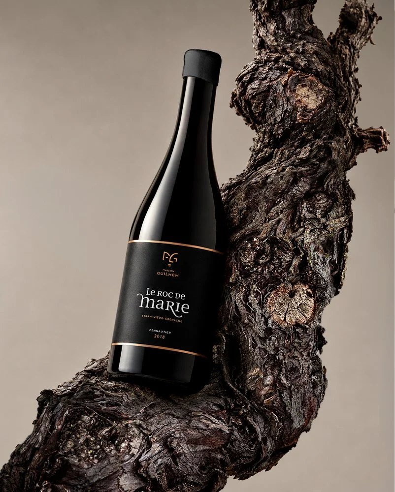
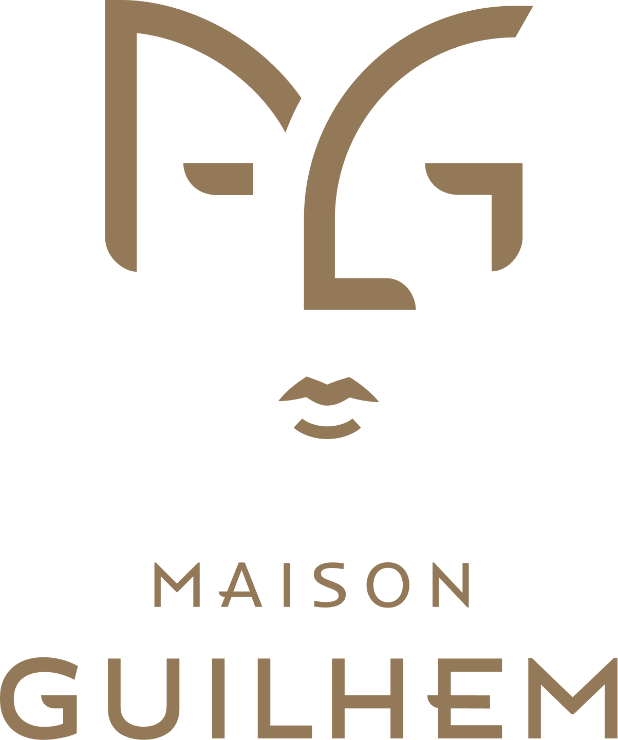
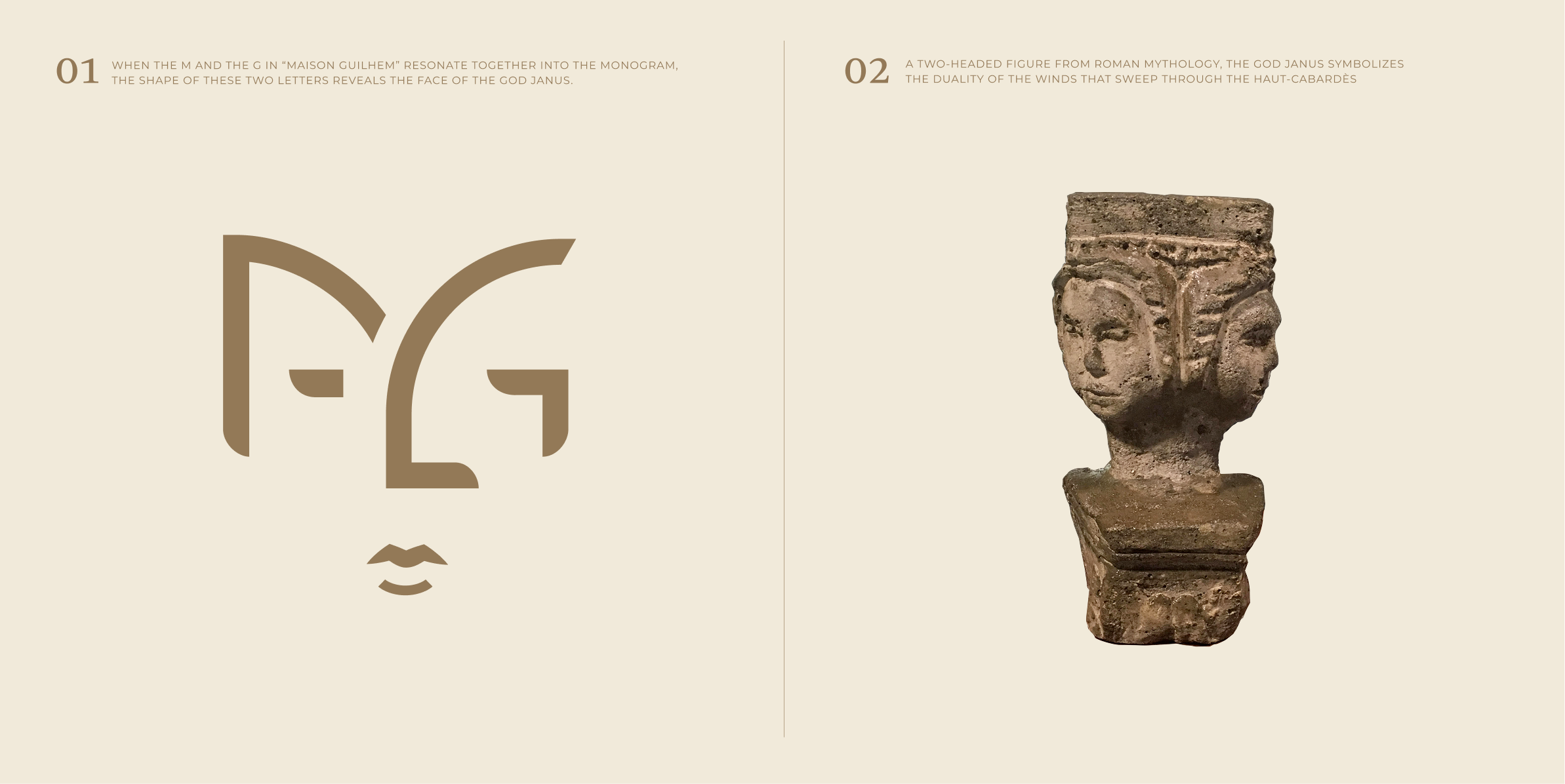
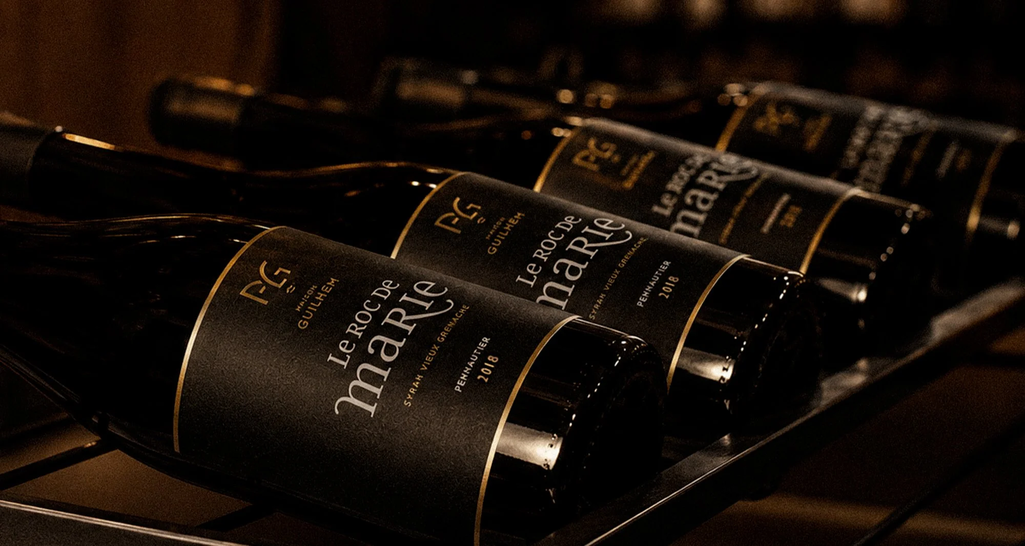
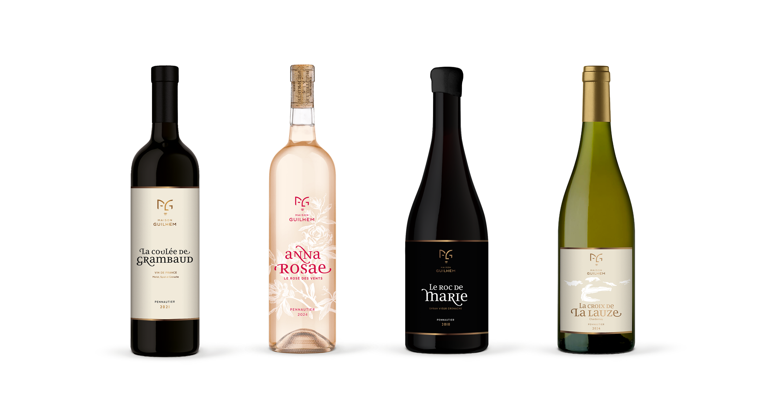
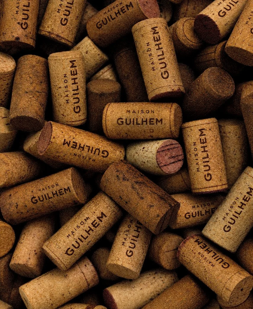
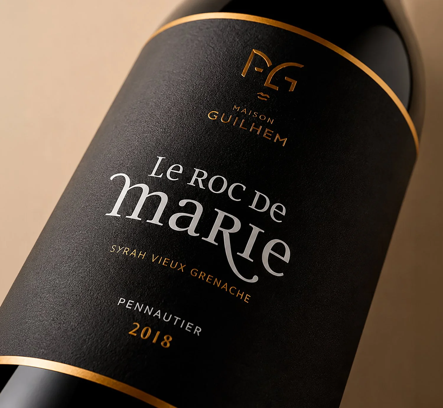
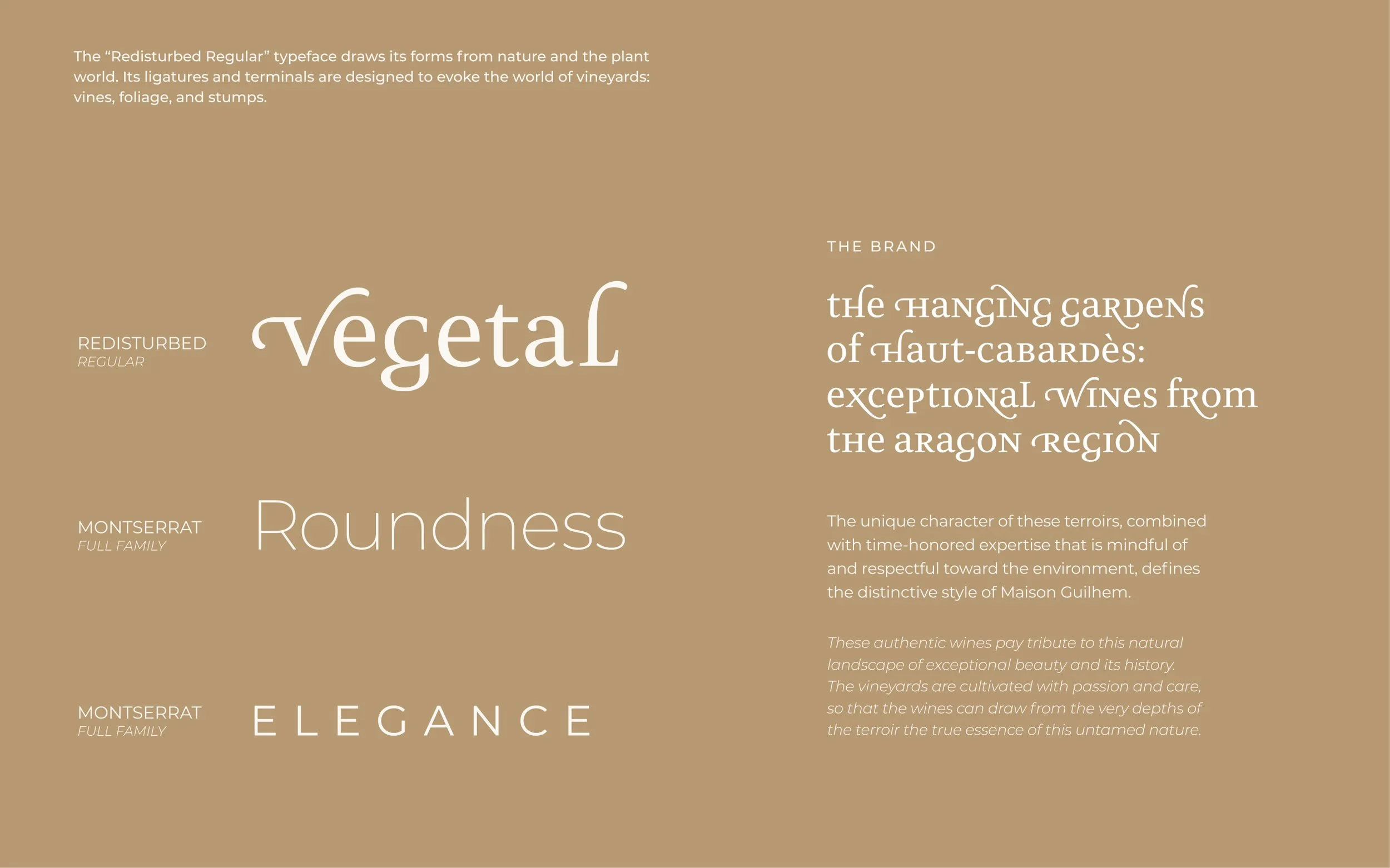
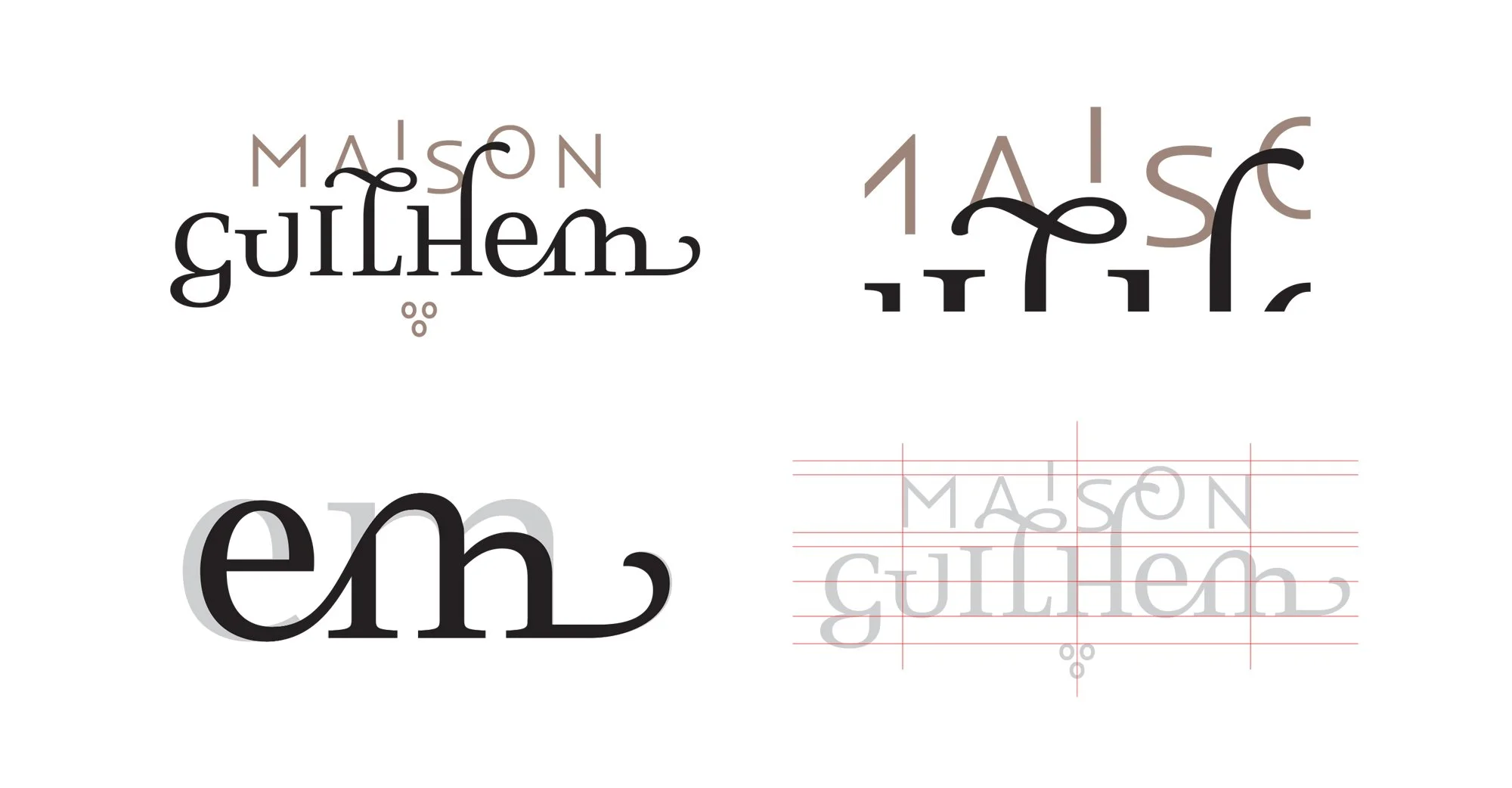
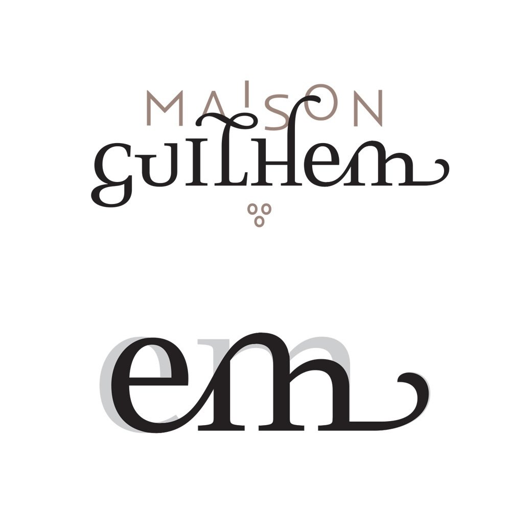
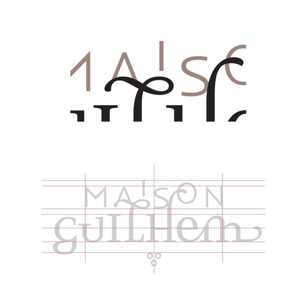
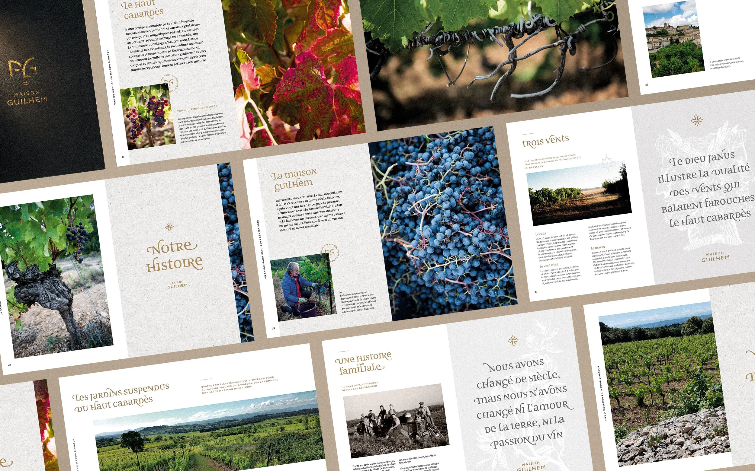
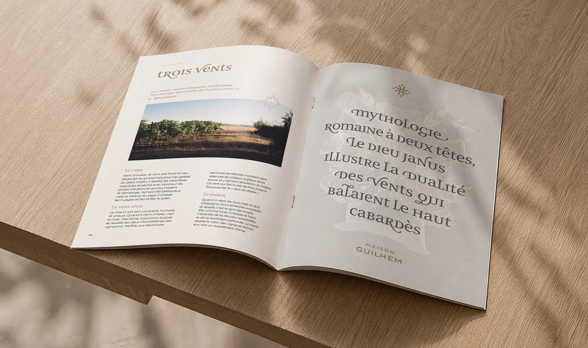
BRANDING & WEBDESIGNAutomne Studio crafted the complete identity of Maison Guilhem, from the wine labels and website to the catalogue and other print assets. The logo is an MG monogram in which the two letters shape a double face inspired by the Roman god Janus, a nod to duality and to the opposing winds so characteristic of the Cabardès terroir of the Languedoc. A bespoke typeface was created specifically for the logo.
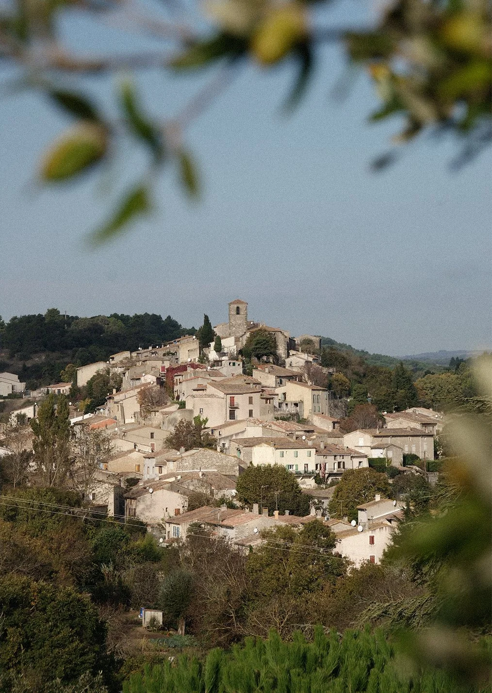
Maison Guilhem is a French family-owned vineyard committed to sustainable agriculture, located near the medieval city of Carcassonne. Rooted in its land and focused on the future, it produces high-quality wines with deep respect for nature, passing a passion for wine from one generation to the next.
“ThE god JANus sYMboLises thE duaLity oF the wiNds that sweep FiERceLY acRoss thE heights oF the CAbaRdès”
Jean Guilhem — Founder

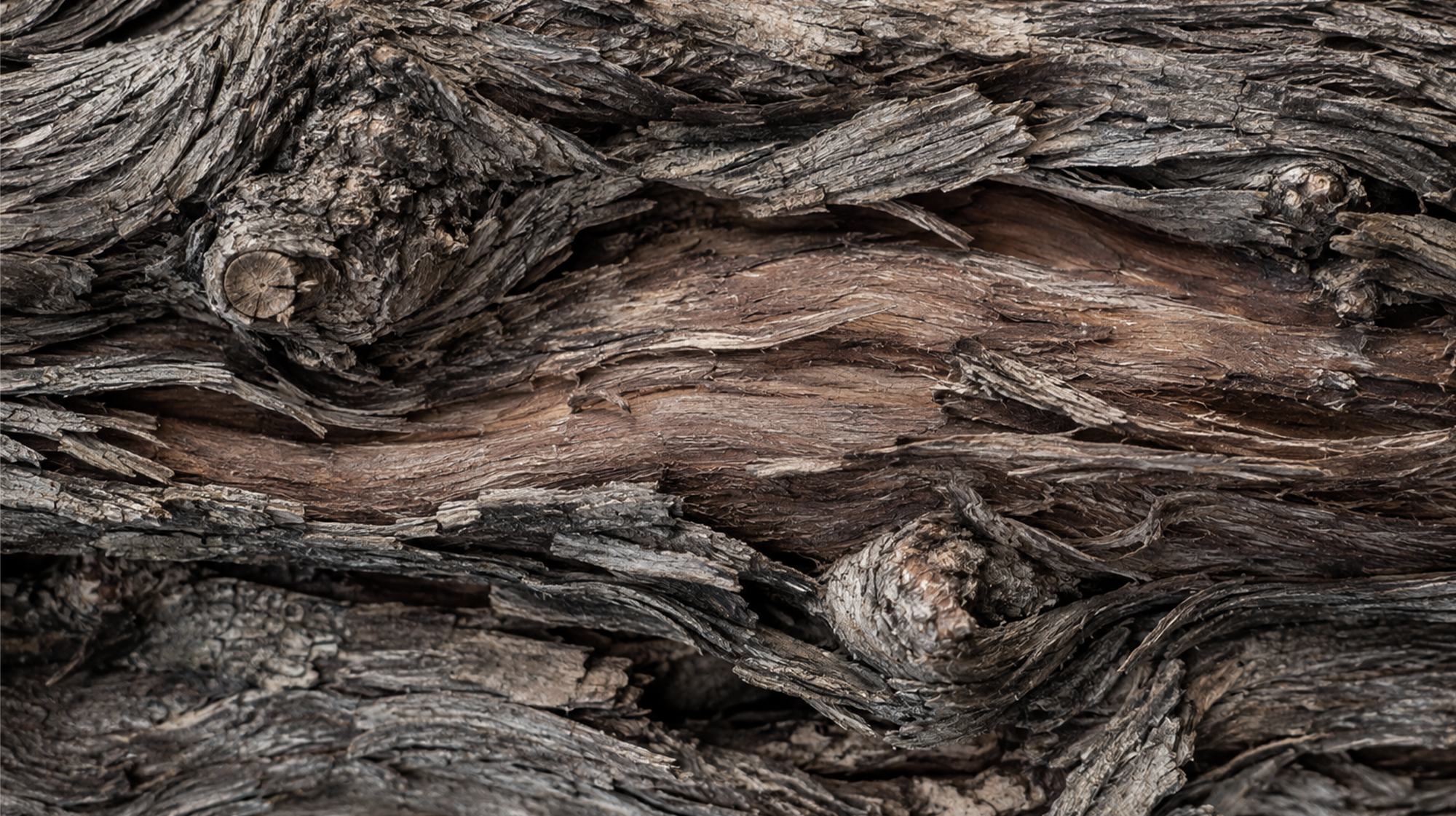
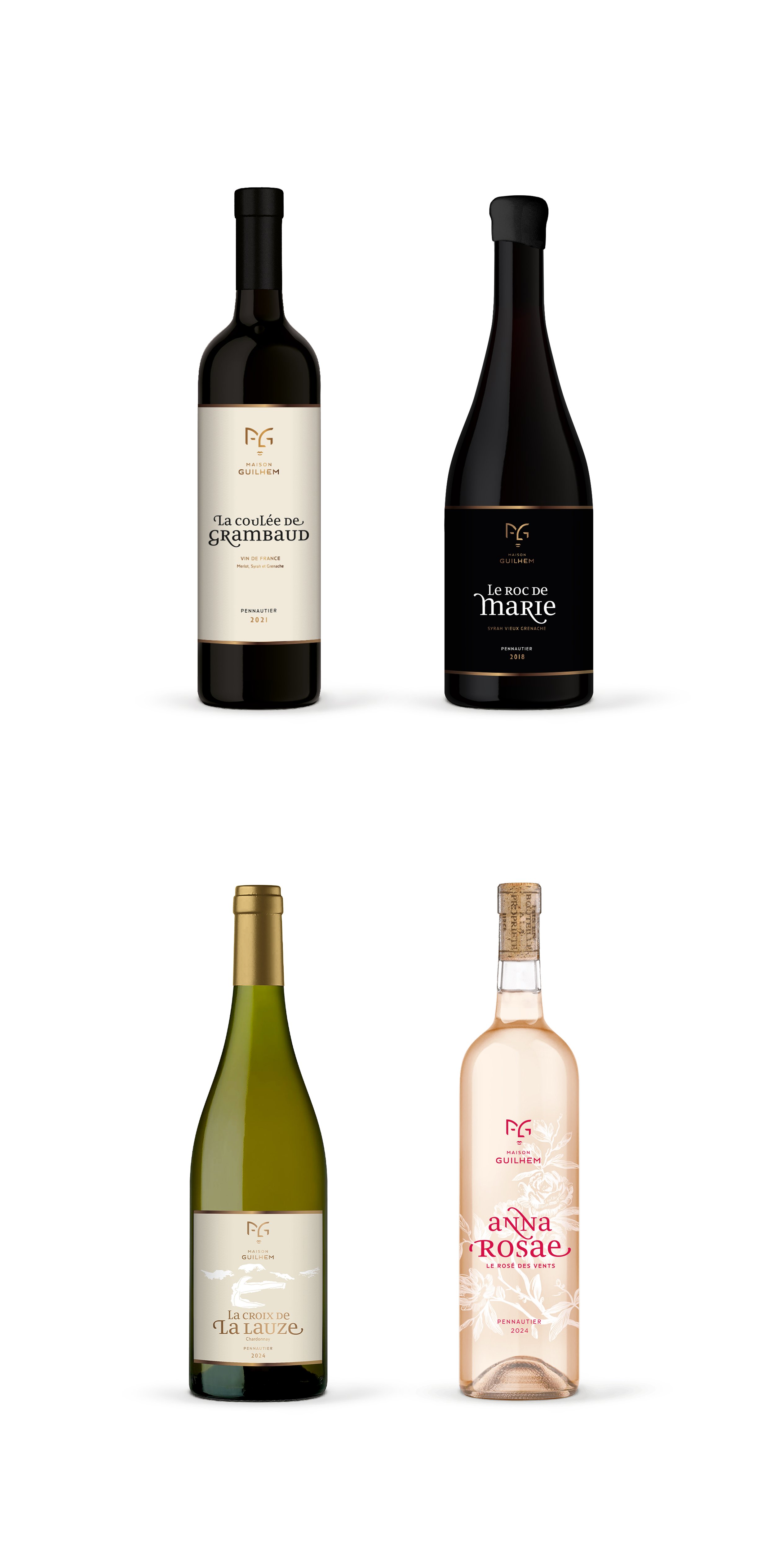
“Wines FuLL oF chARactER, boRN oF A wiLd and FeRAL teRRoir“
Jean Guilhem — Founder
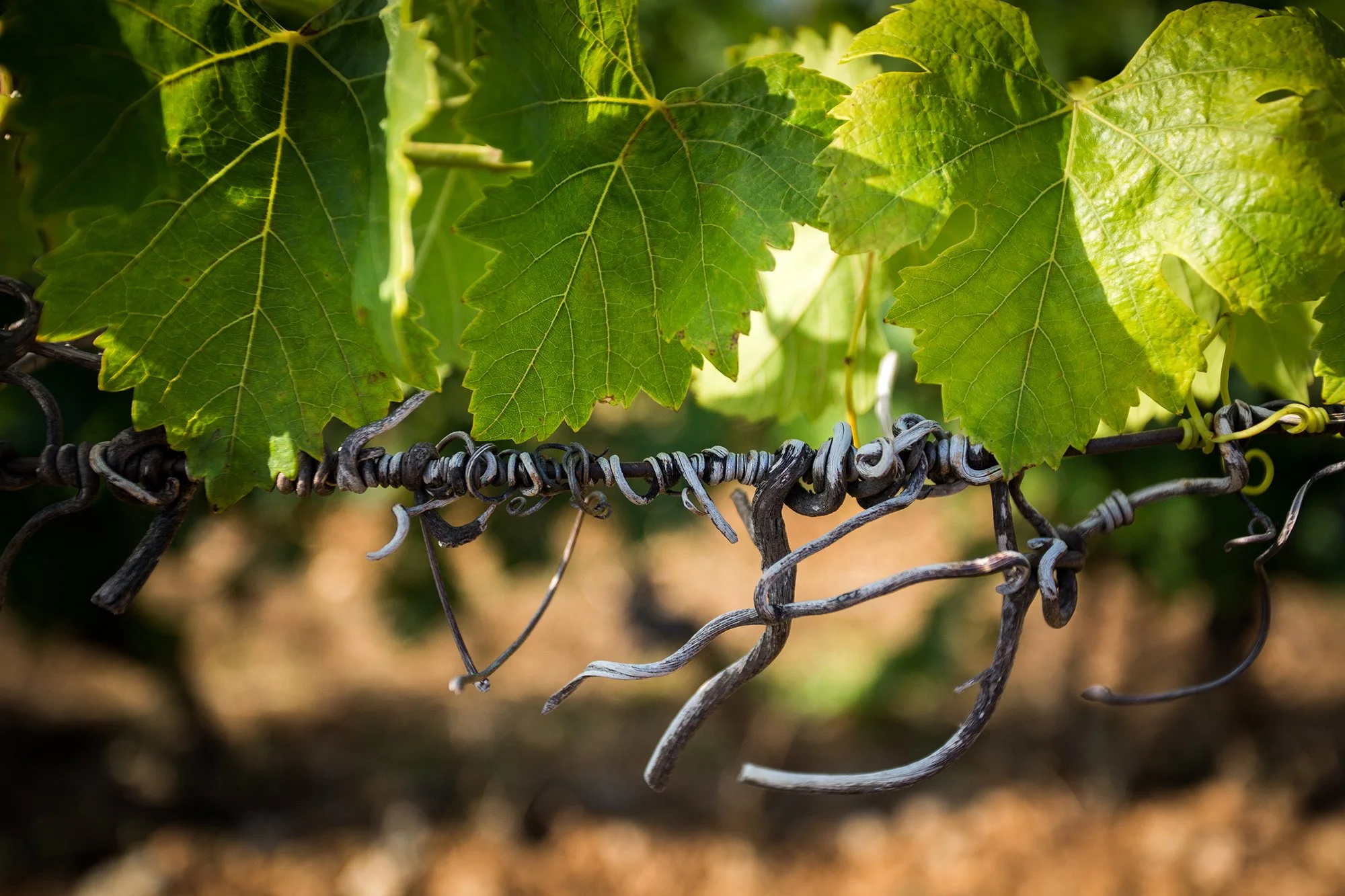
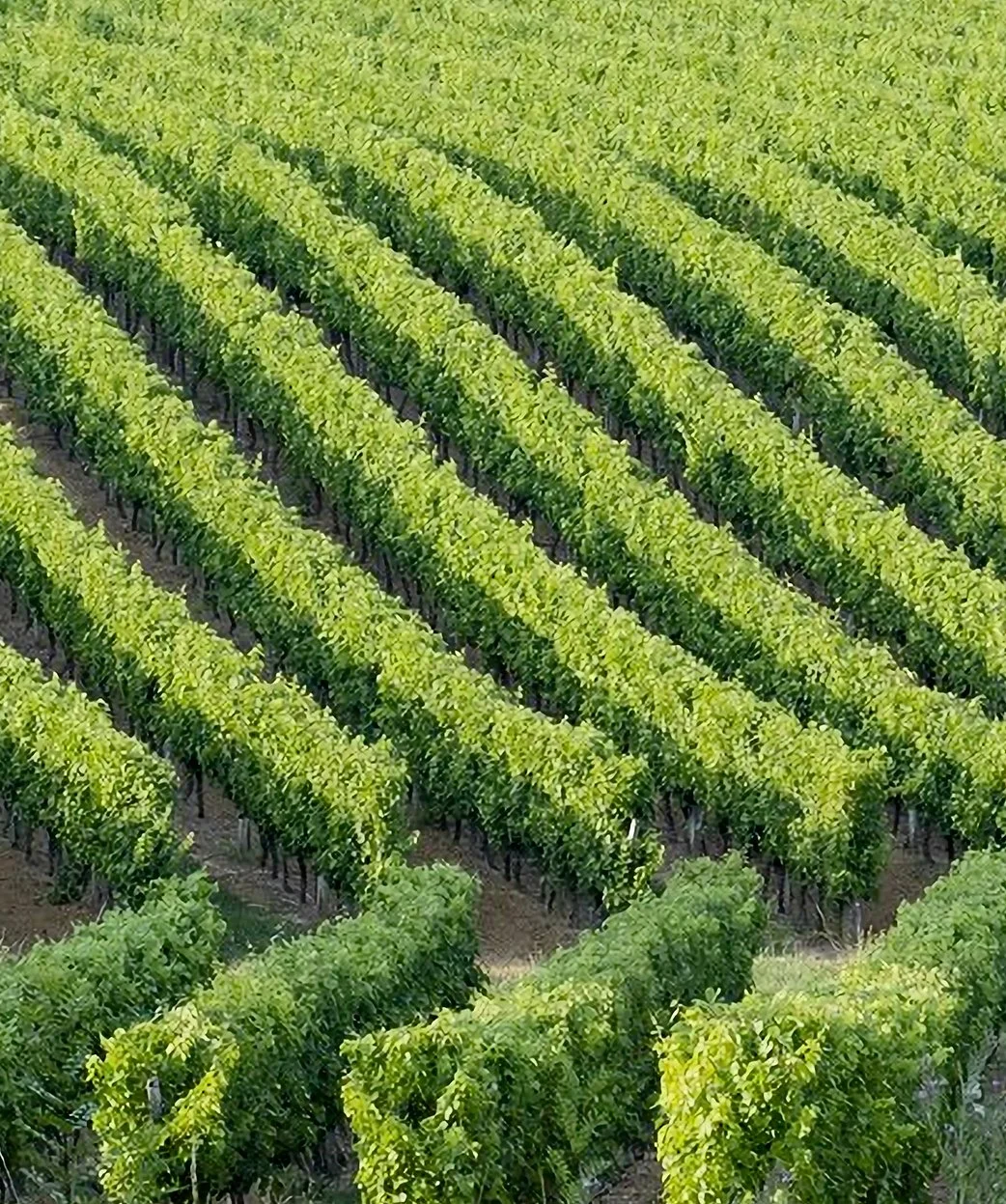
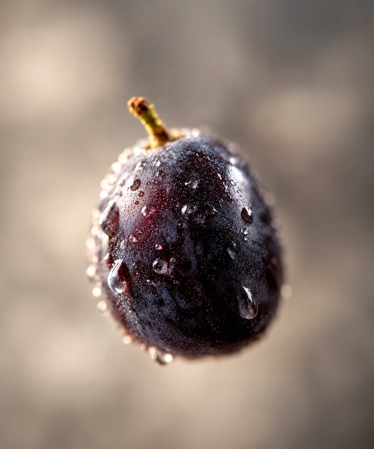
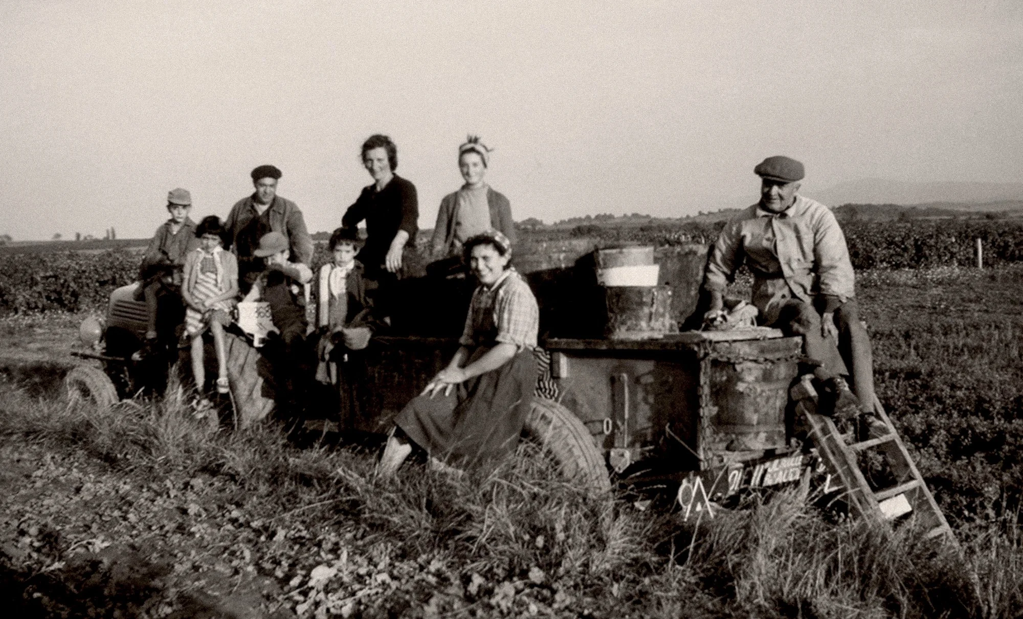
“The LANd is cuLtivated with passioN and cARE, Letting the wiNes capture thE tRUE EssencE oF this untAMEd NatuRe”
Maison Guilhem

Design services
Branding
Editorial Design
Packaging
Webdesign
Related
www.maisonguilhem.com
Collaborators
Web Development: Thomas Klapper
Photo credits
©Automne Studio, ©Jean Guilhem