BRANDINGPastOe
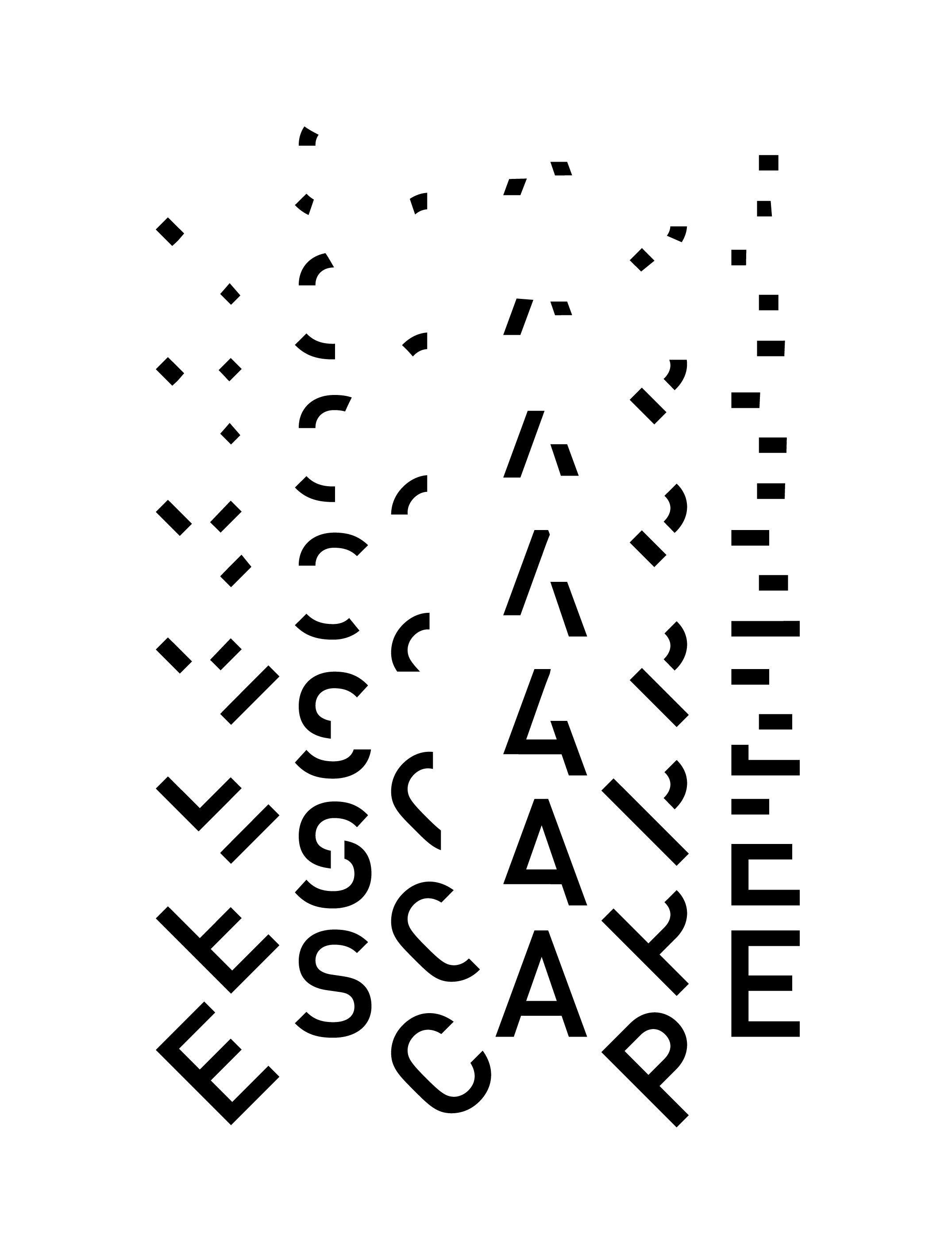
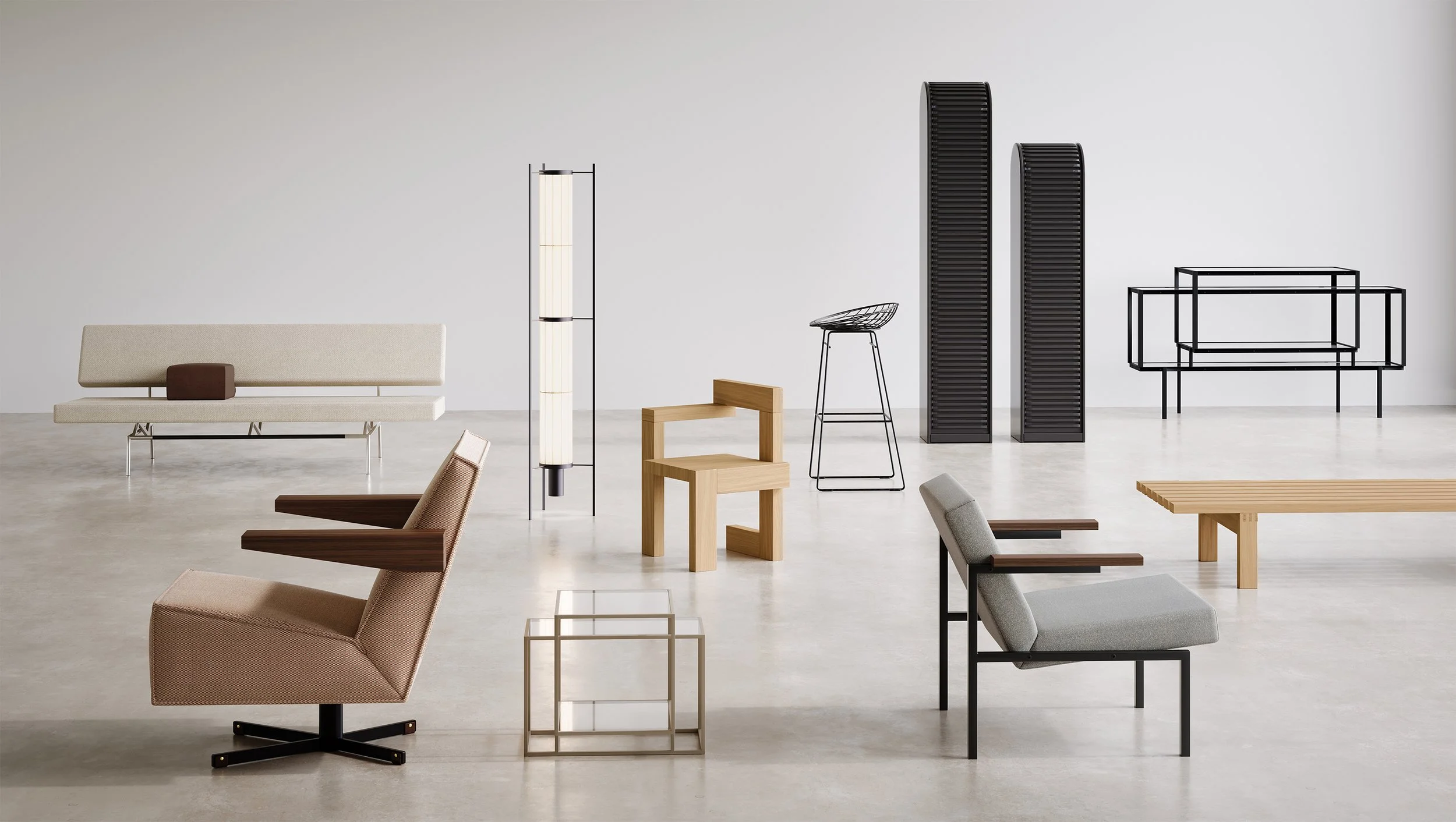
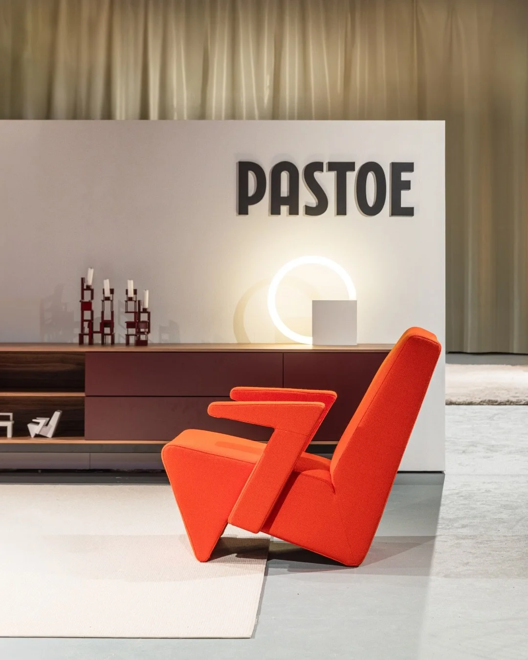
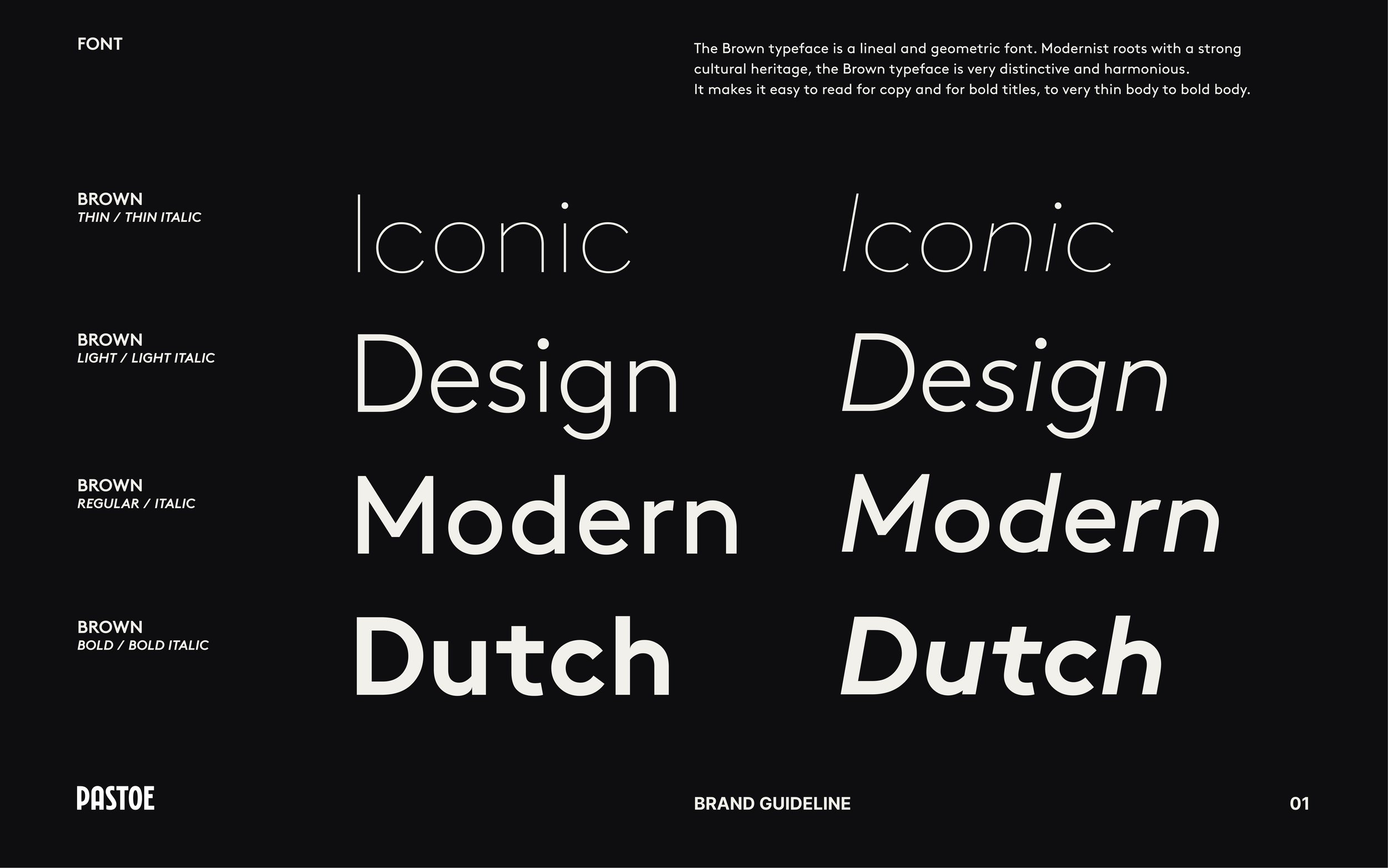
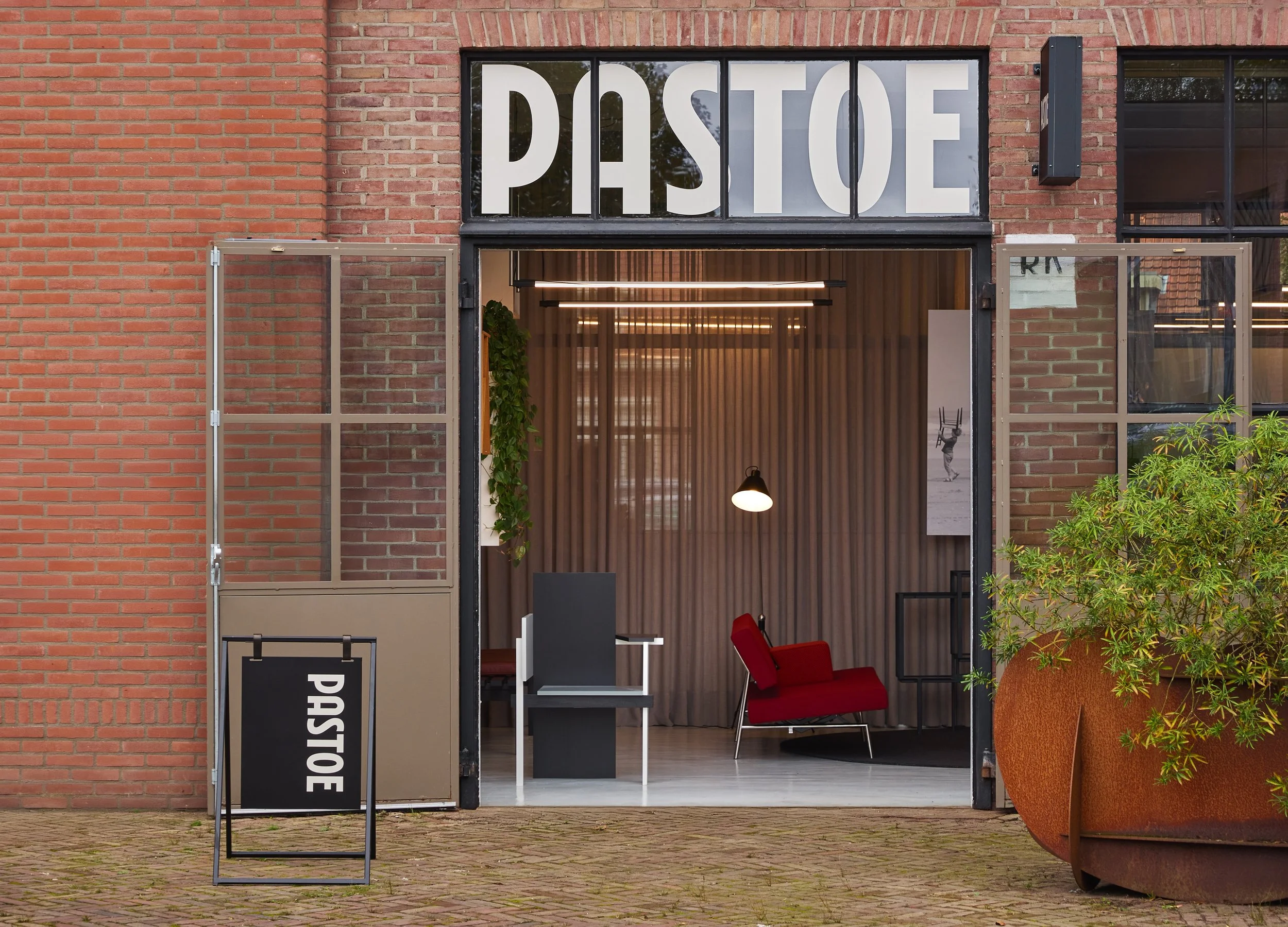
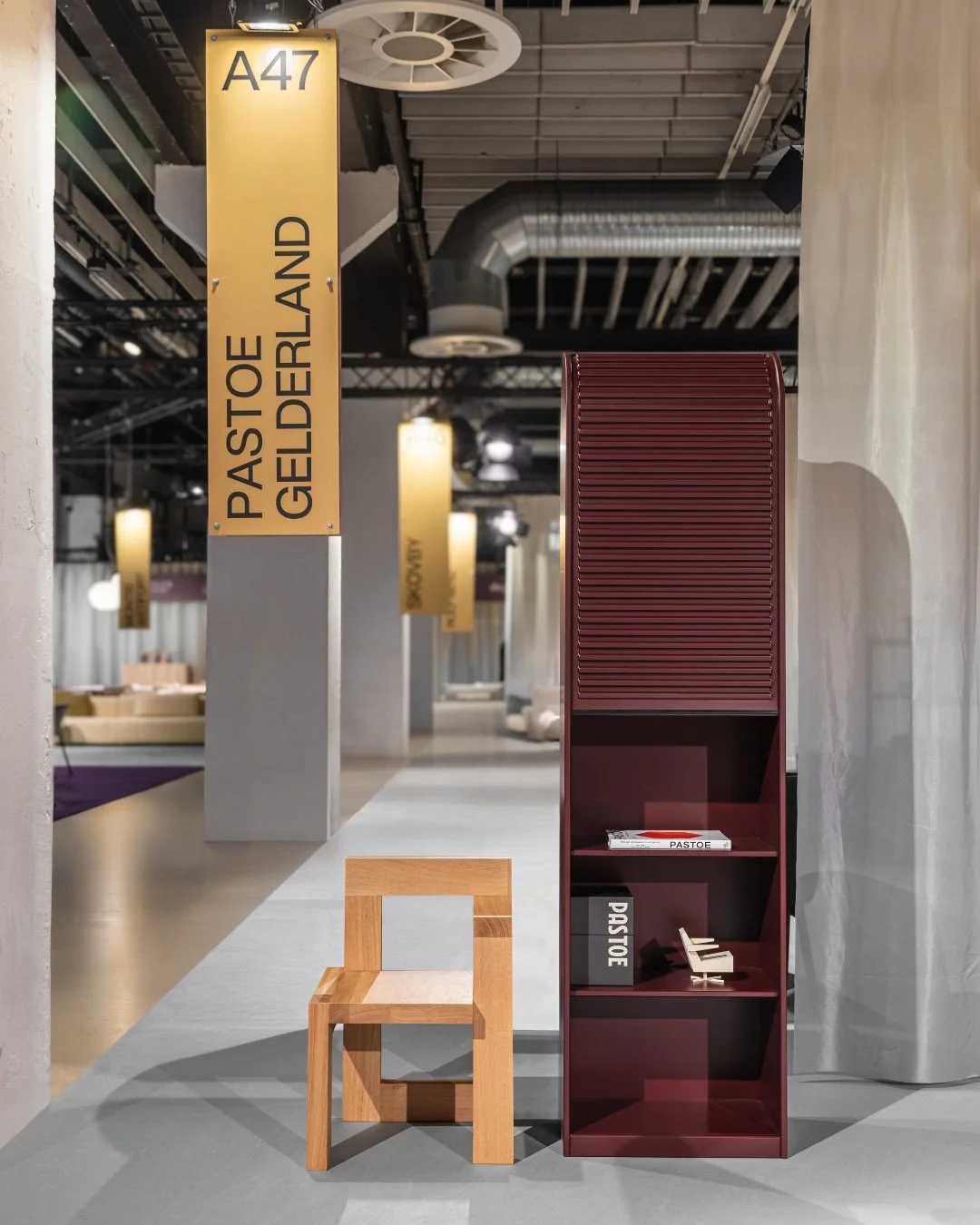
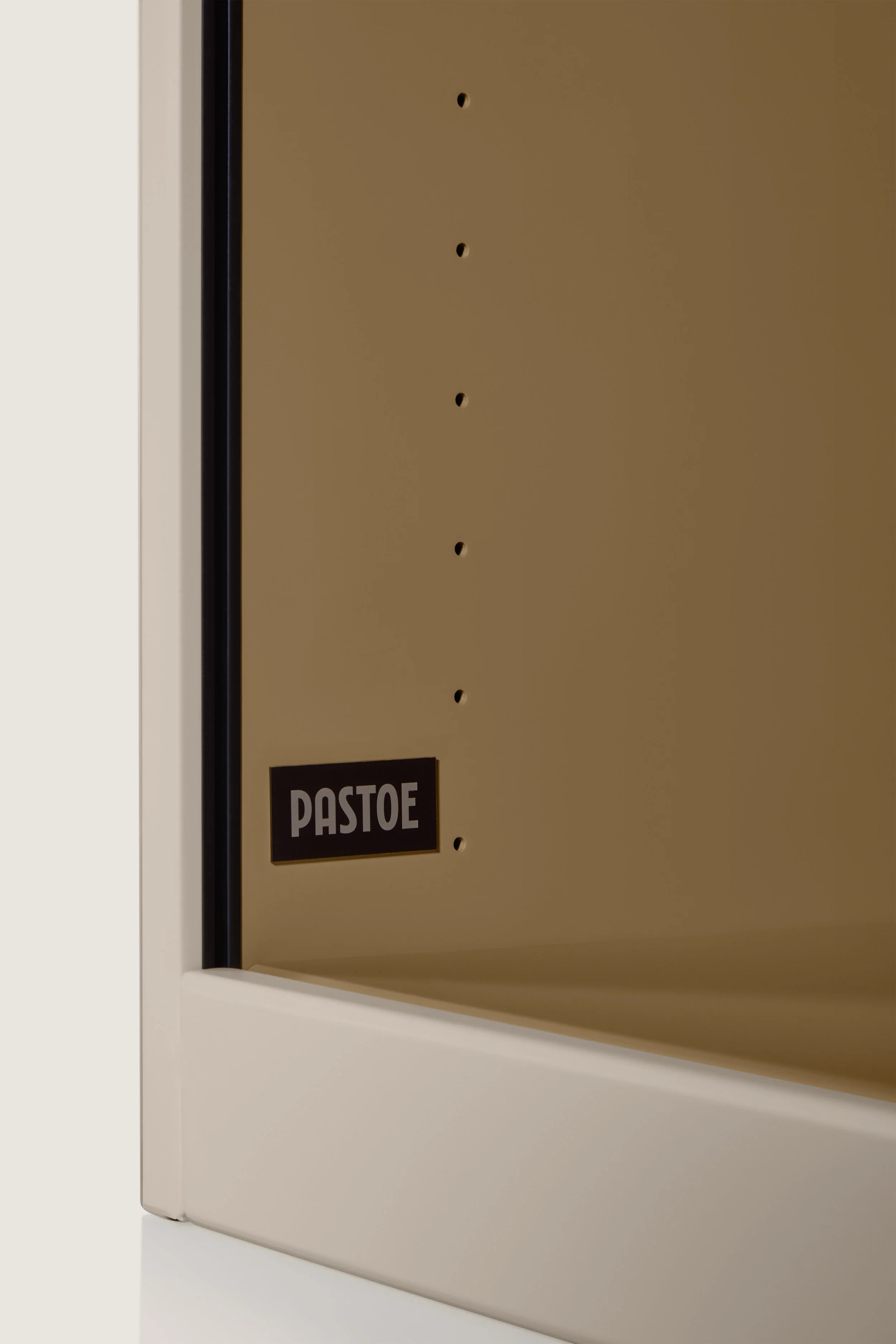
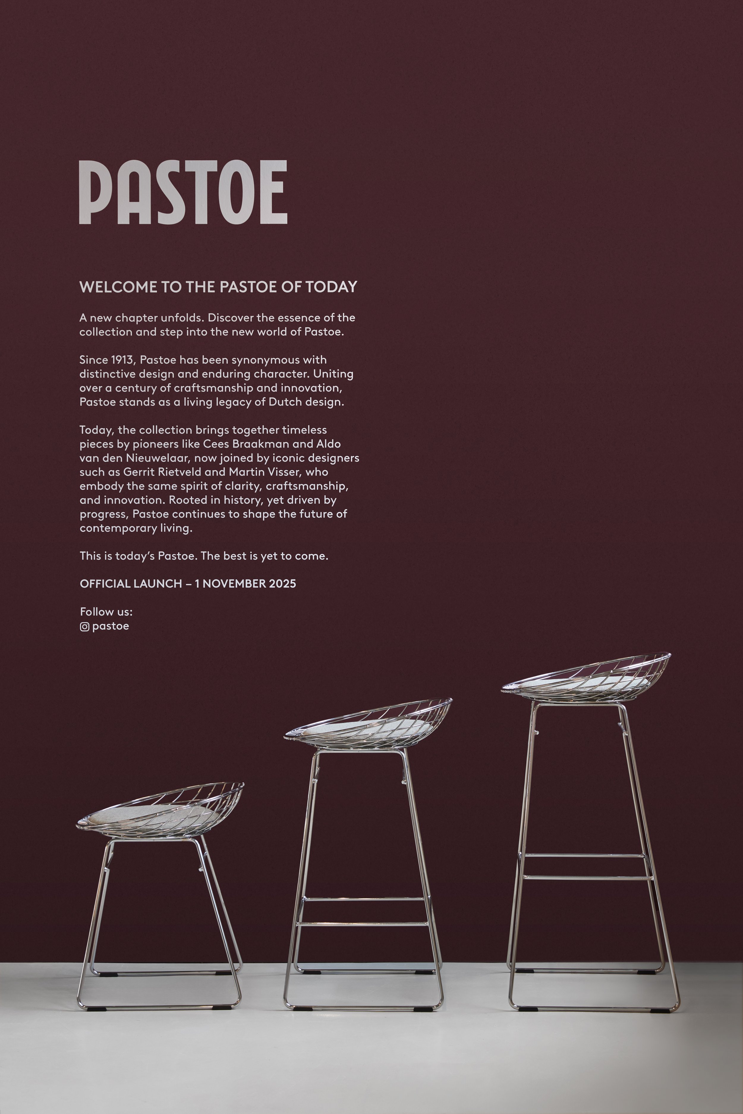
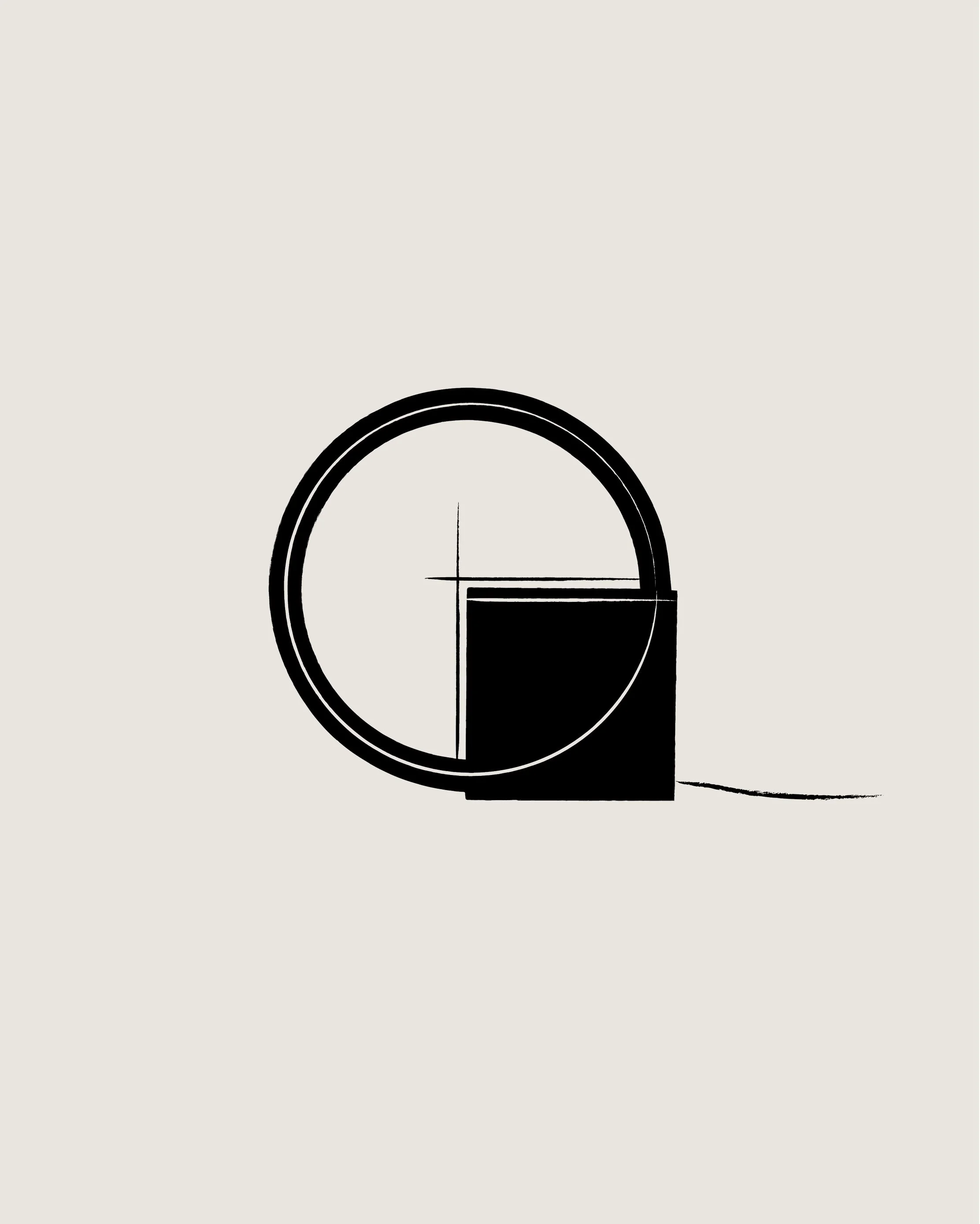
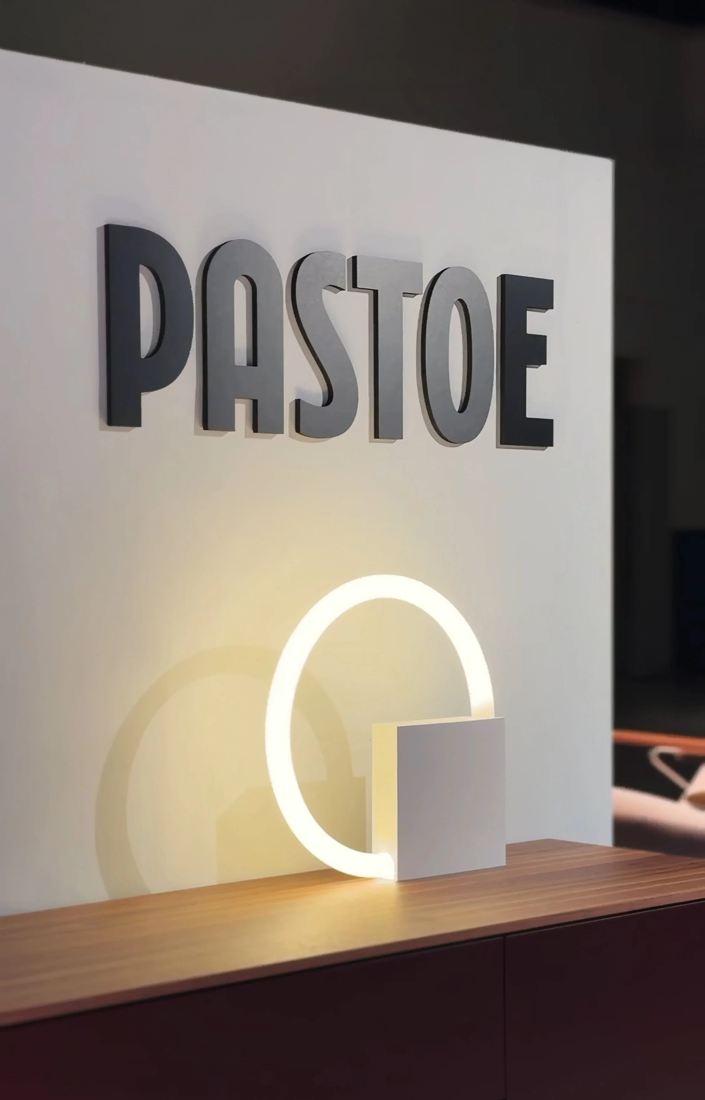
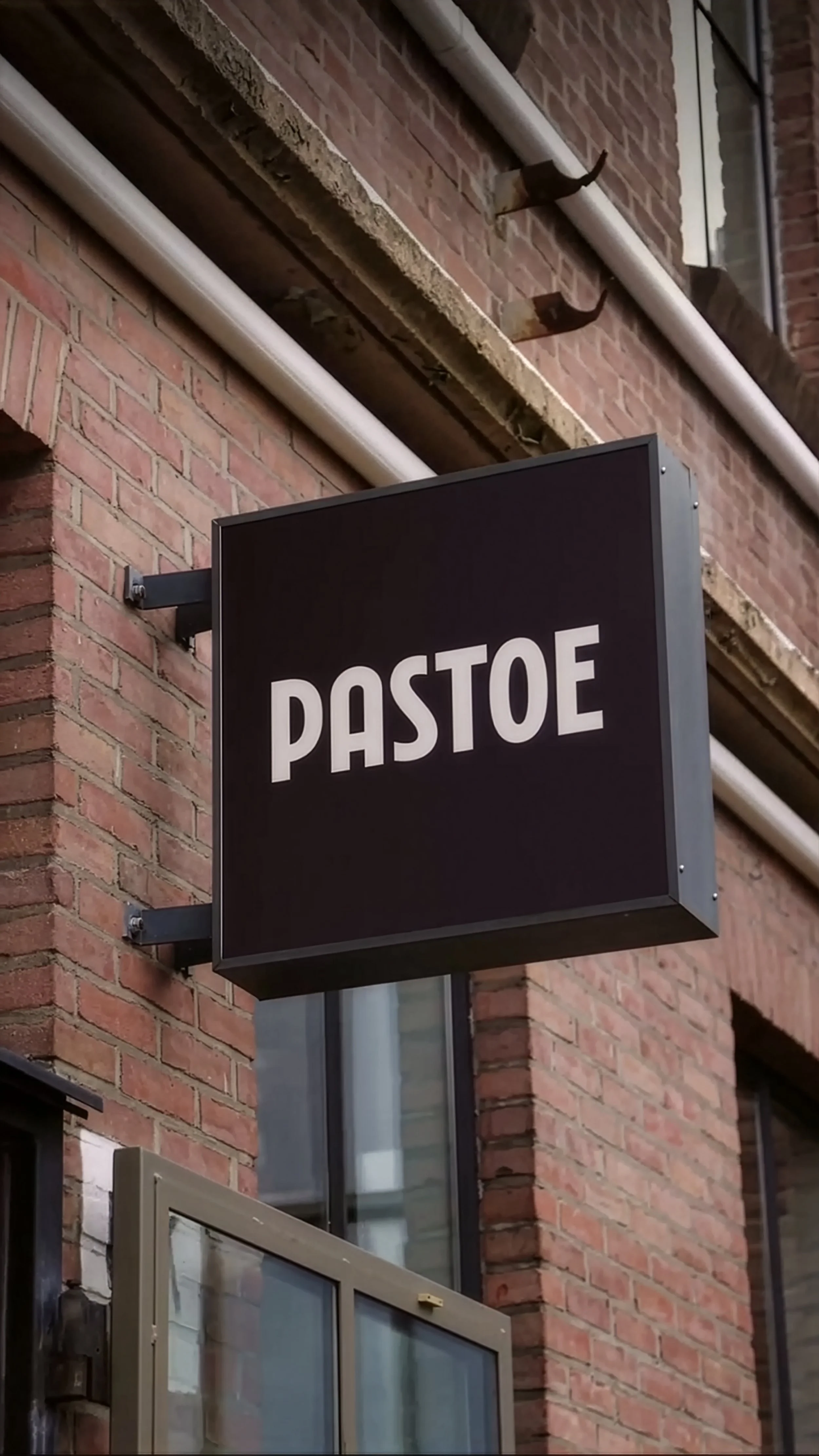
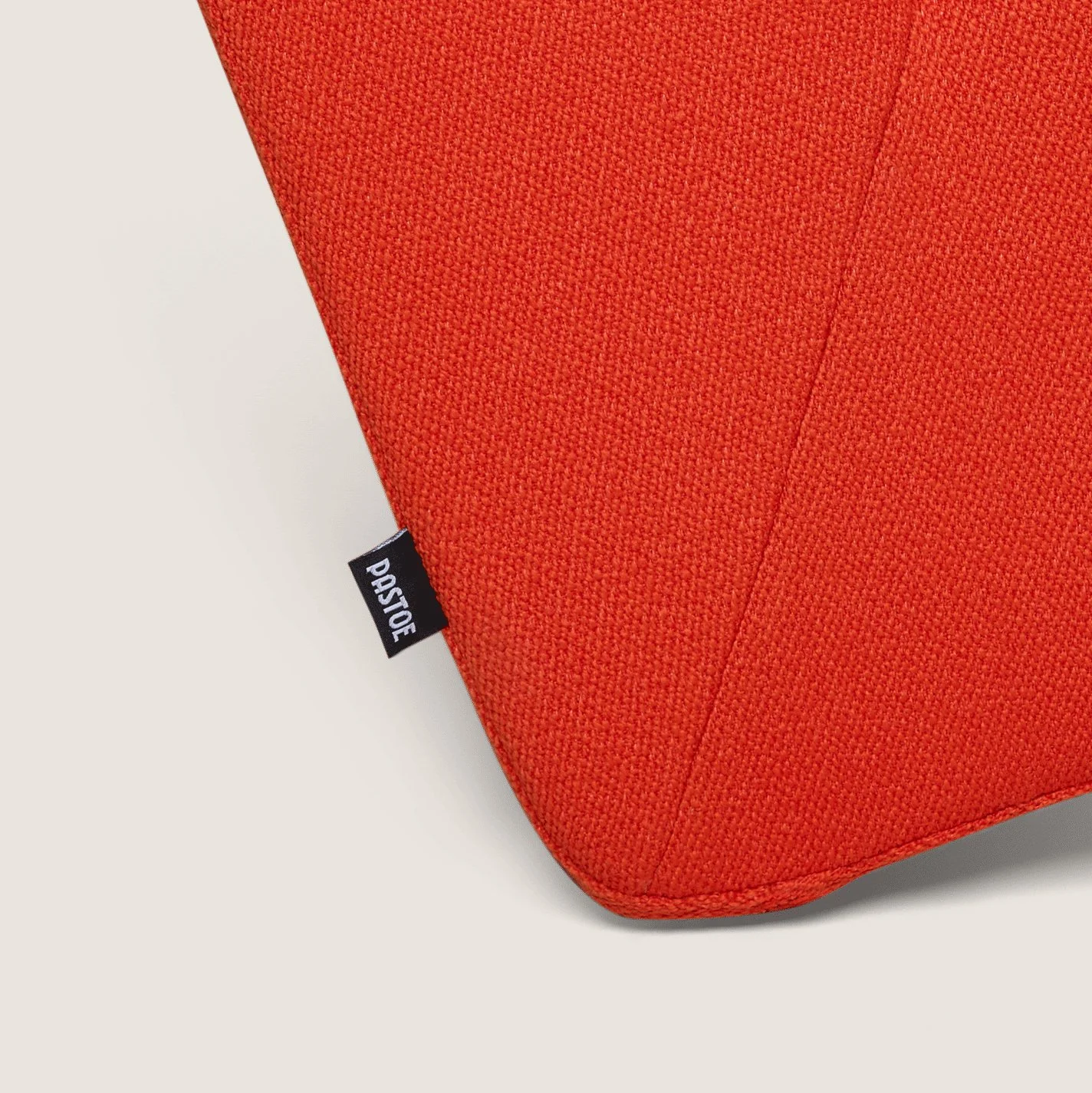
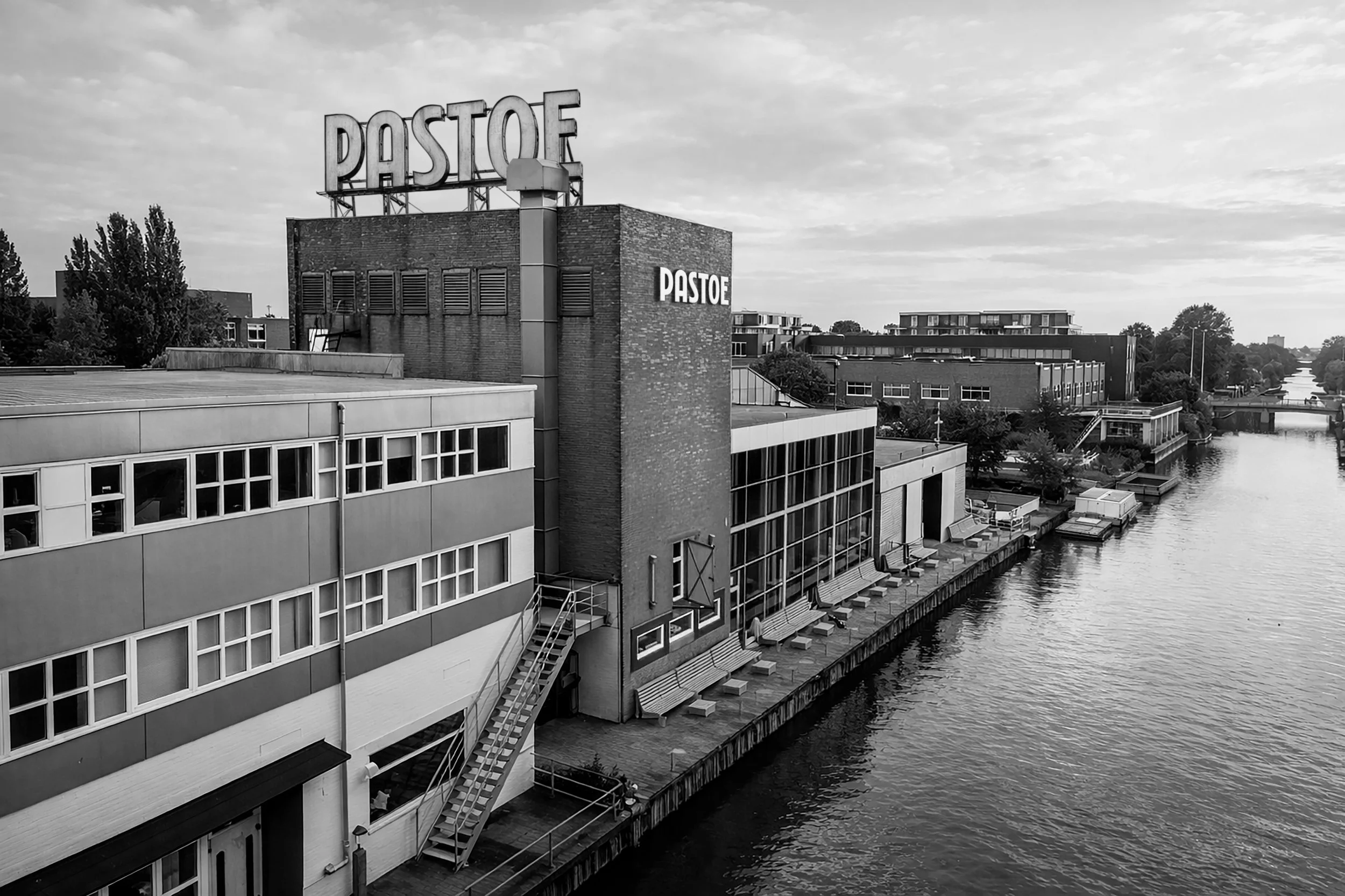
Automne Studio designed the new identity of Pastoe, introducing a refreshed logo where the “A” is more than just a letter: it’s a tribute to the iconic “A’dammer” cabinet designed in 1978 by Aldo van den Nieuwelaar. “A’dammer” takes its name from the well-known bollards found throughout the streets of Amsterdam. Masters of minimalism and timeless Dutch furniture design since 1913, Pastoe has always been synonymous with leading designs full of character.
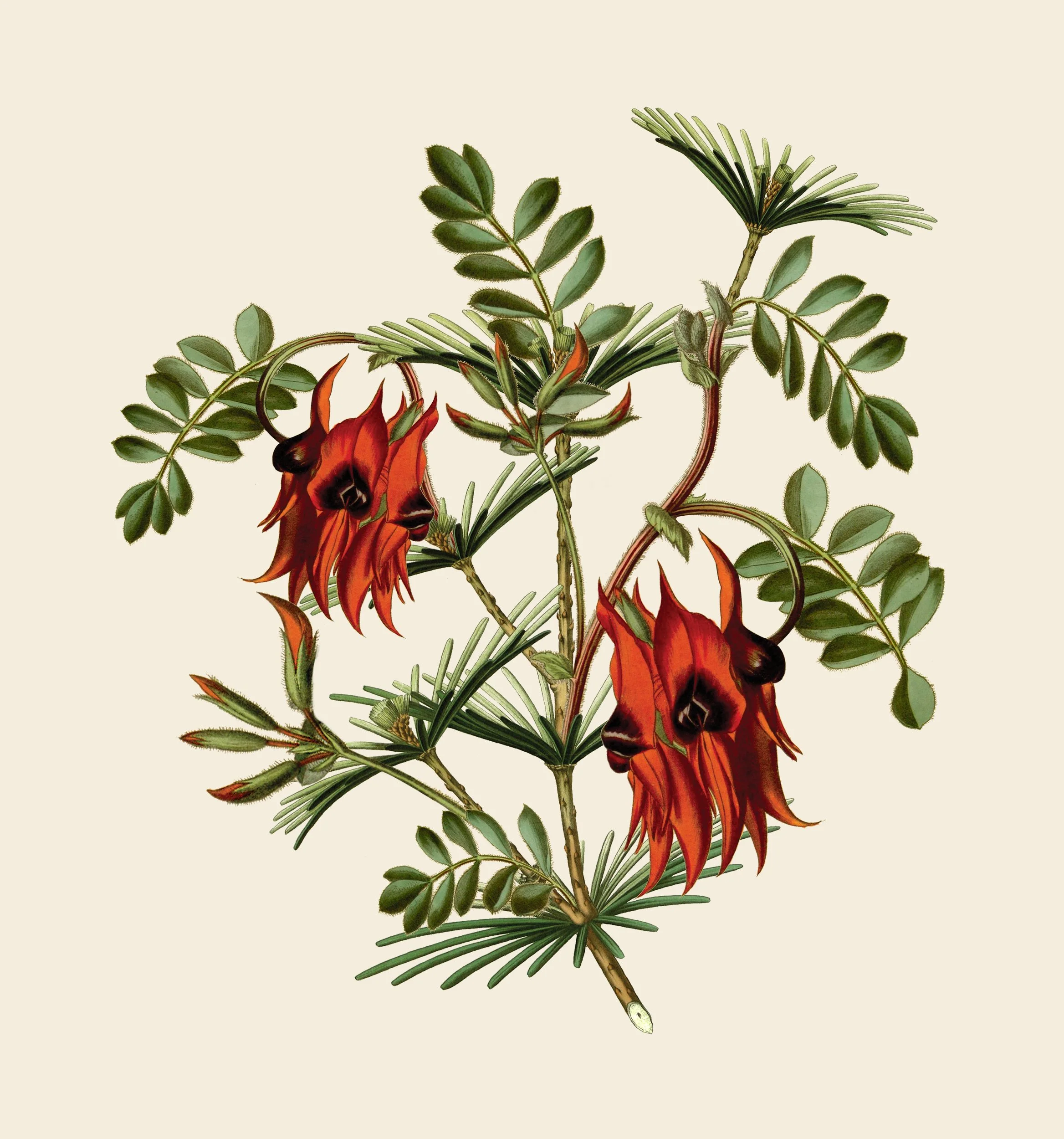
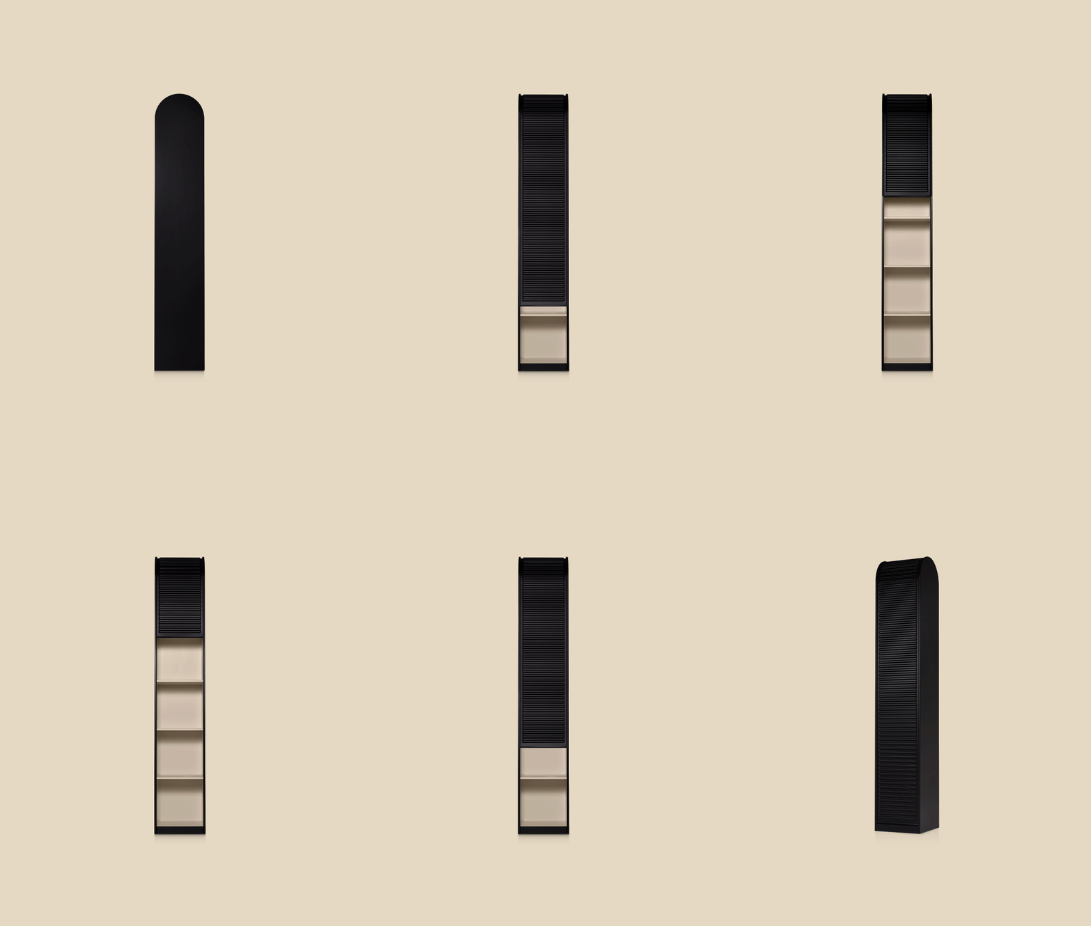
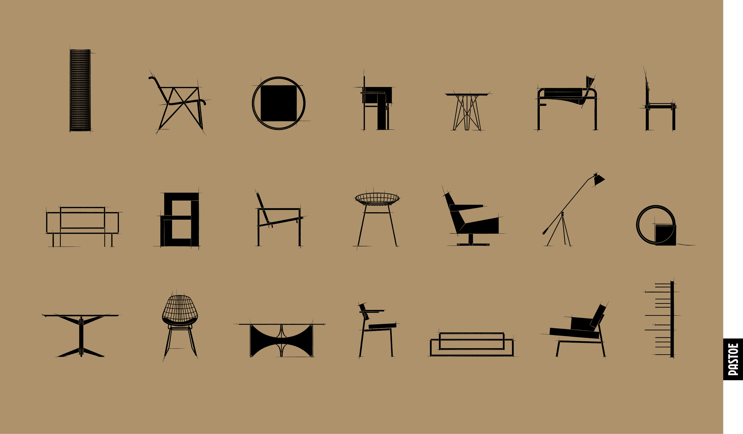
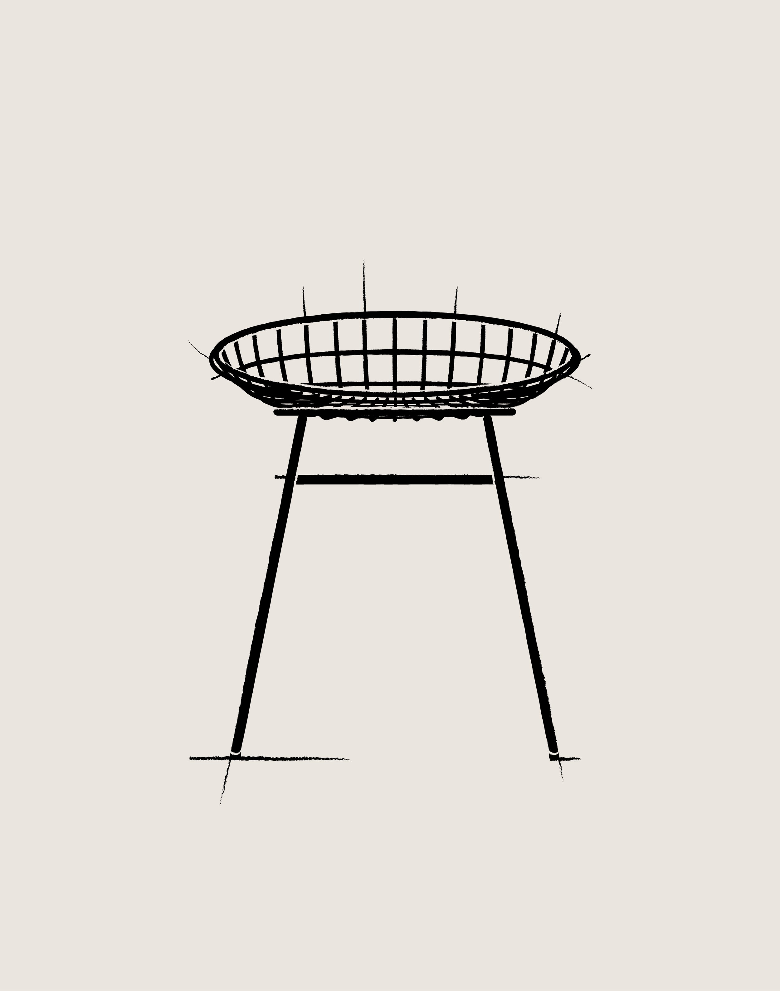
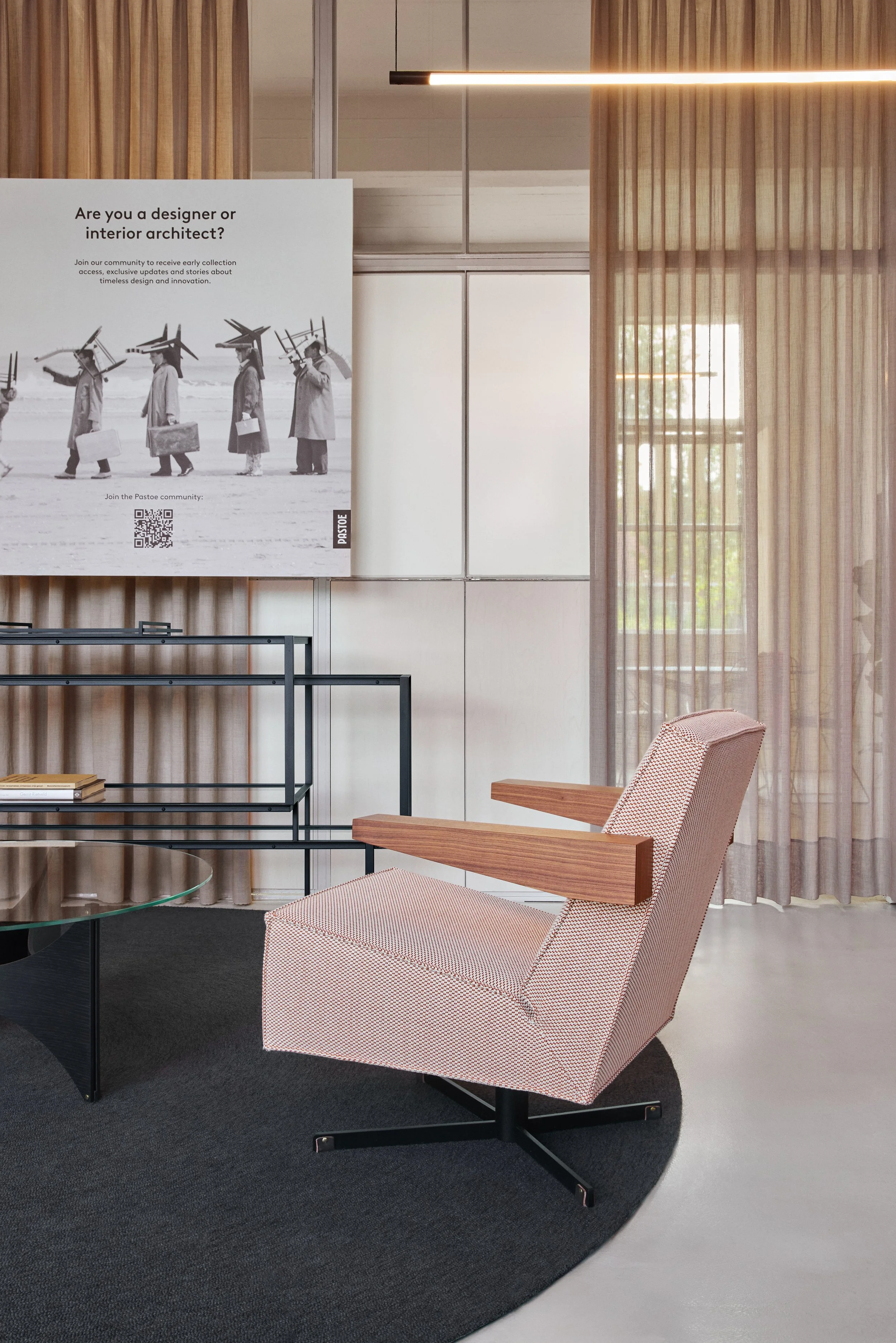
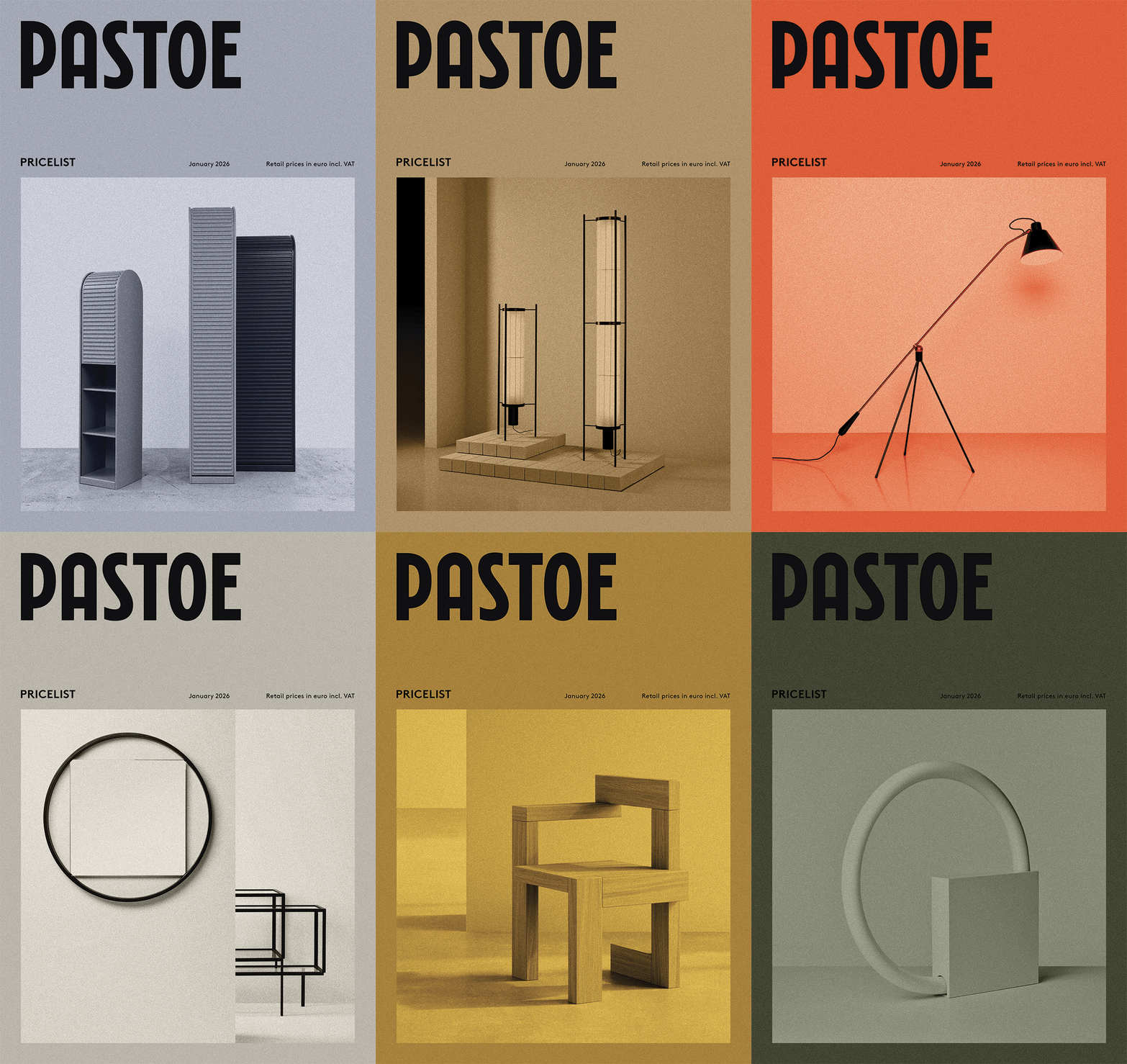
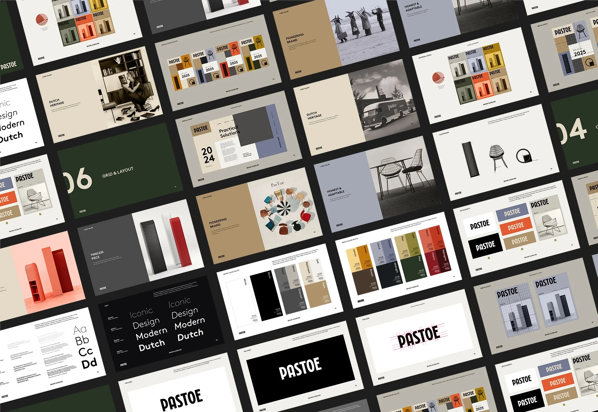
Beyond the identity, Automne Studio created the complete set of illustrations for the Pastoe furniture collection, translating each piece into a refined graphic language that echoes the brand's minimalism. The studio also art directed all editorial content, ensuring a cohesive visual voice.
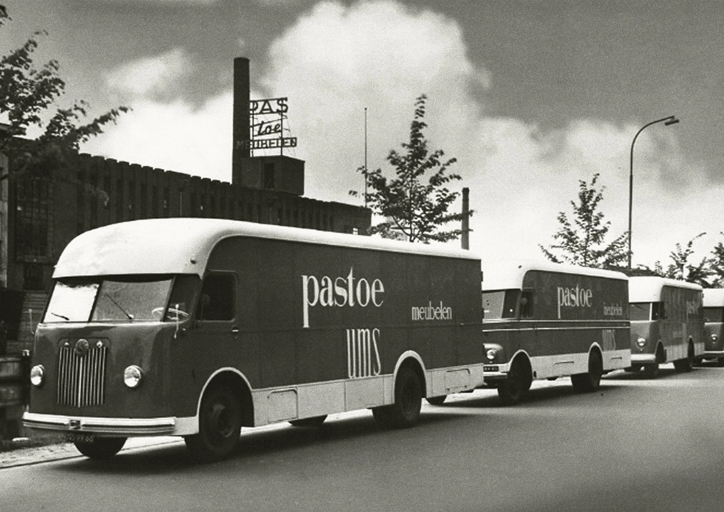
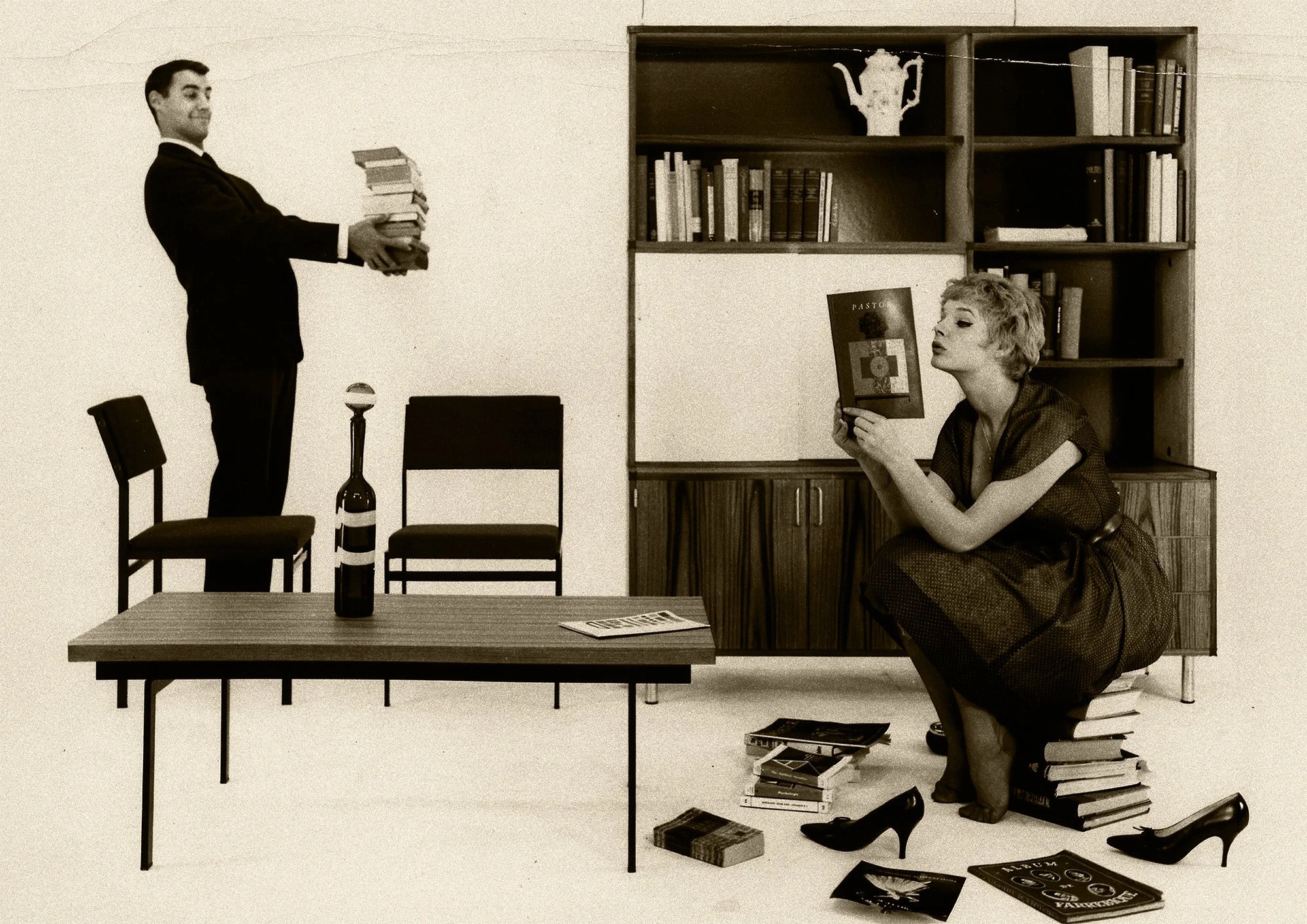
While embracing the future, Pastoe’s essence remains unchanged: pioneering and timeless design. Pastoe’s new color palette is a warm tribute to its rich history, where subtle shades and timeless tones have always been key. Inspired by Pastoe’s own archives and vintage designs, it connects past and present, offering an identity that feels both familiar and refreshingly new.
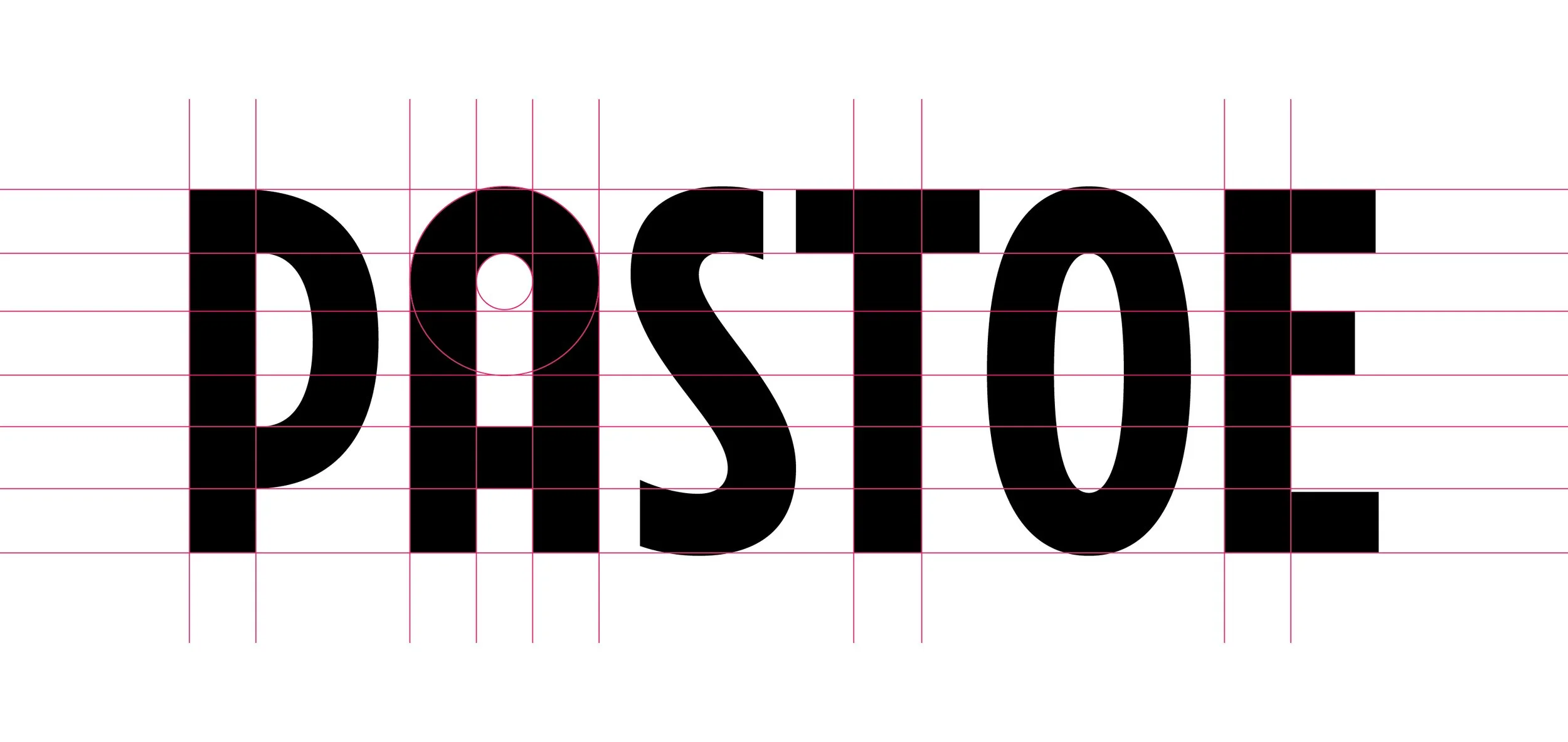
The “A” shape FuLLY beLongs to Pastoe, it’s a tRibutE to the icoNic A’daMMER
Pastoe — Timeless Design Furniture
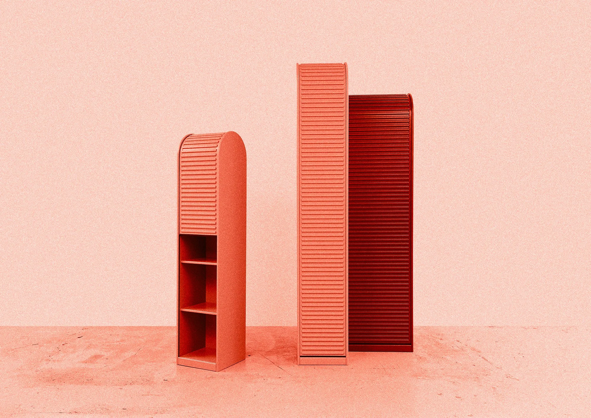

“Pastoe opEns a NEw chapteR with A REnewEd idENtitY and timeLEss design that bRidges pAst and FUtuRe”
Pastoe — Timeless Design Furniture
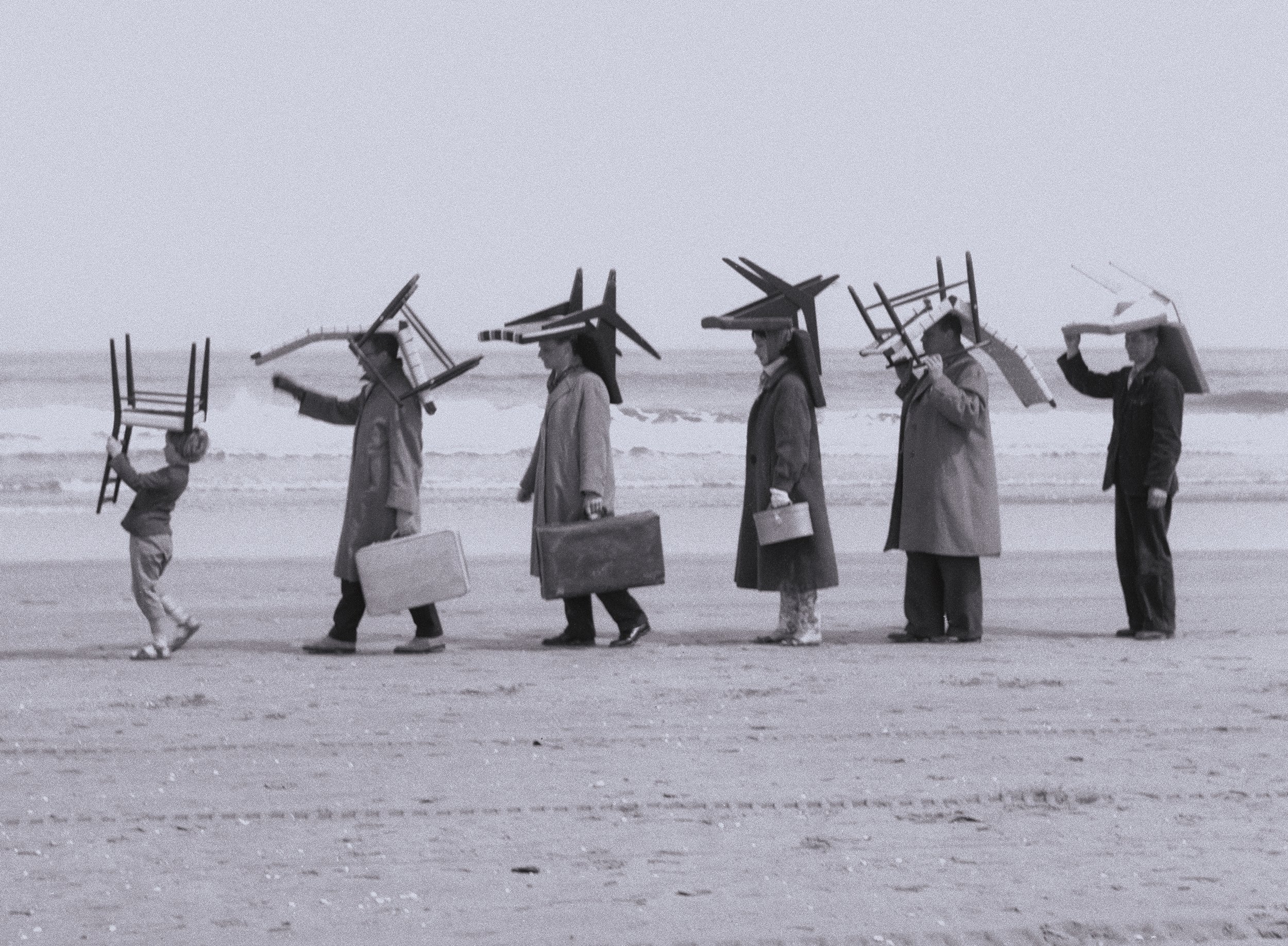
“WhiLE eMbRAciNg thE FUtuRe, Pastoe's EsseNce reMAiNs unchaNgEd:
pioneeRiNg & timeLEss desigN”
Pastoe — Timeless Design Furniture
Design services
Branding
Editorial Design
Illustration
Related
www.pastoe.com
Photo credits
©Automne Studio, ©Pastoe,
©RSGA Design